12 more of 14 images
This editorial opens with a PREMIUM membership
STANDARD currently covers editorials published since 2026.04
PREMIUM · the full archive since 2019
See membershipPREMIUM · the full archive since 2019
DOWNLOADS
Cover and logo image downloads are for Standard members.
Contributing creators: the tearsheet and hi-res images of your own editorial are included from Standard (€5.49/mo).
Contributing creators: the tearsheet and hi-res images of your own editorial are included from Standard (€5.49/mo).
Personal, non-commercial use only
FAQ
Why does LADY IN RED use different colors than its title suggests?
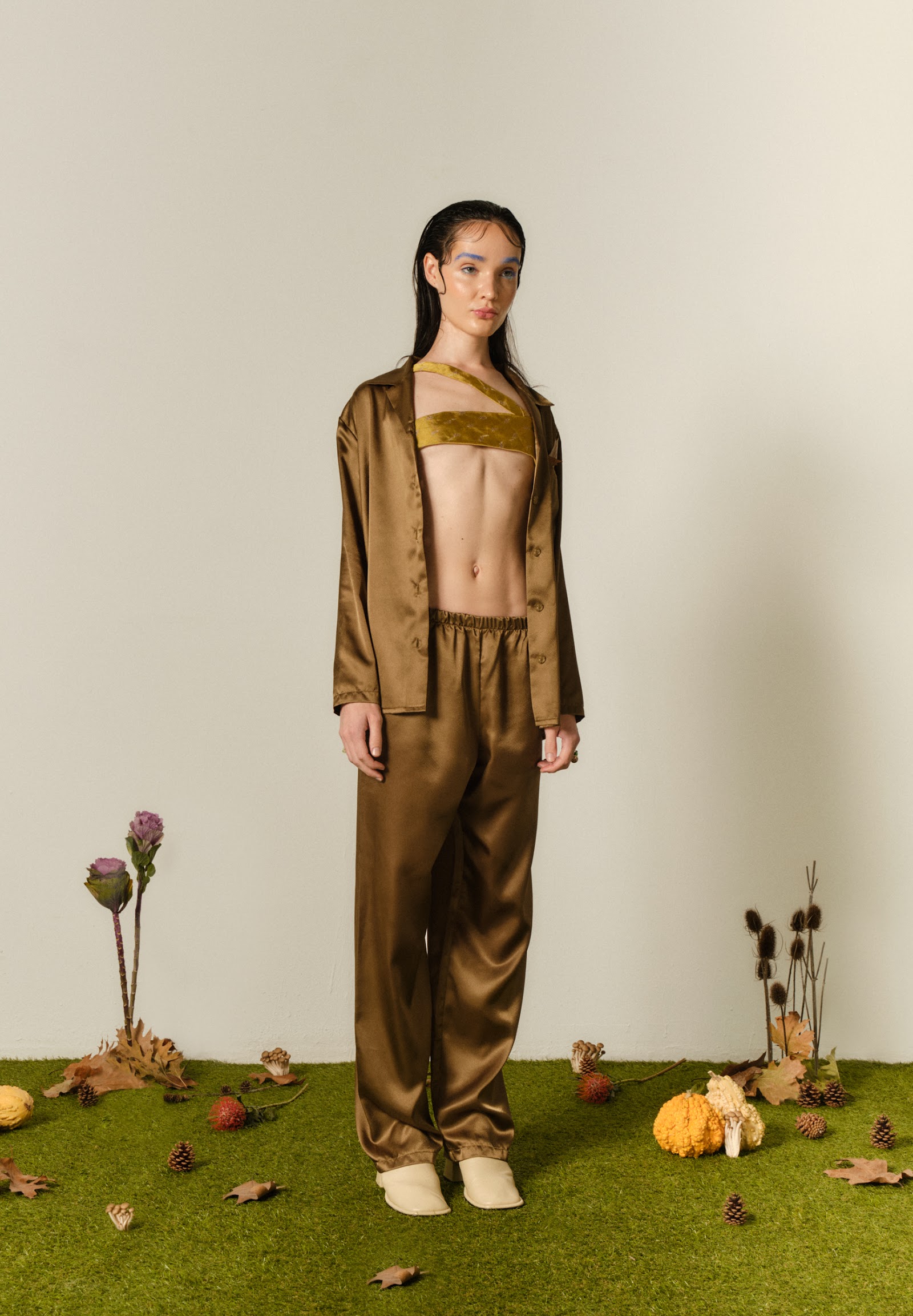
Contrary to the title, it uses a gold-olive palette instead of red, creating a conceptual mood that presents visual irony through chromatic subversion.
What styling appears in LADY IN RED?
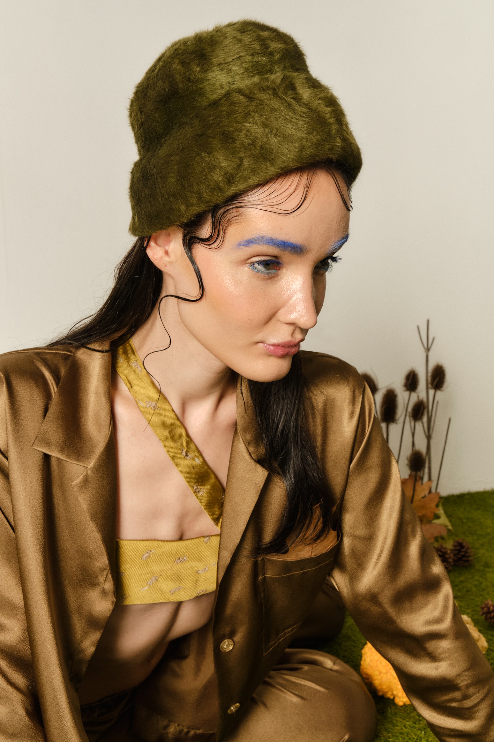
Gold satin slip dress layered under an oversized shirt jacket, olive-toned velvet bandeau top with wide pants deconstructing pajama suiting, and olive green fur bucket hat with blue eyeshadow translating late-'90s club kid sensibility into contemporary terms.
How was the LADY IN RED set constructed?
Artificial grass flooring scattered with dried flowers, pine cones, and fallen leaves staged an autumn forest inside the studio, building a conceptual mood that blurs the boundary between natural and artificial.