19 more of 21 images
This editorial opens with a PREMIUM membership
STANDARD currently covers editorials published since 2026.04
PREMIUM · the full archive since 2019
See membershipPREMIUM · the full archive since 2019
DOWNLOADS
Cover and logo image downloads are for Standard members.
Contributing creators: the tearsheet and hi-res images of your own editorial are included from Standard (€5.49/mo).
Contributing creators: the tearsheet and hi-res images of your own editorial are included from Standard (€5.49/mo).
Personal, non-commercial use only
Brands in this editorial
FAQ
What is the concept of the WAR OF VENUS editorial?
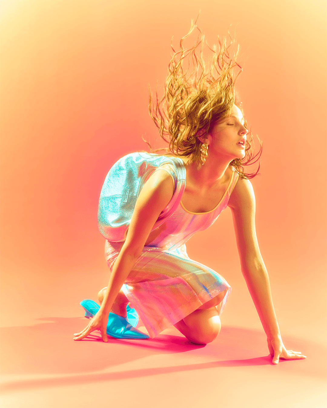
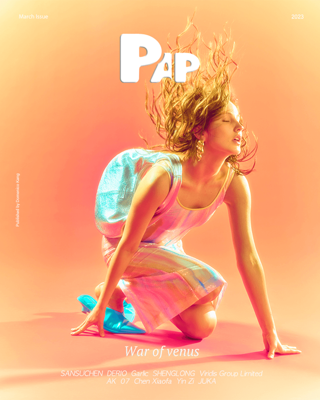
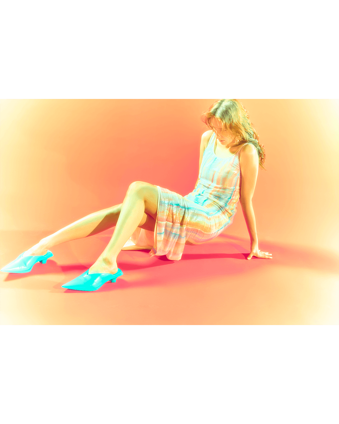
Using iridescent organza and peplum silhouettes to recreate Y2K digital art's plastic sheen, it delivers—contrary to its title—a sensory feast of color and light.
What colors and materials were used in WAR OF VENUS?
Pink and apricot gradient backdrops, iridescent organza shifting to mint and lavender, and turquoise patent mules for punctuation.
How was hair styled in WAR OF VENUS?
Compositions captured hair explosively surging upward, visualizing pure kinetic energy within the stillness of a studio setting.