11 more of 13 images
This editorial opens with a PREMIUM membership
STANDARD currently covers editorials published since 2026.04
PREMIUM · the full archive since 2019
See membershipPREMIUM · the full archive since 2019
DOWNLOADS
Cover and logo image downloads are for Standard members.
Contributing creators: the tearsheet and hi-res images of your own editorial are included from Standard (€5.49/mo).
Contributing creators: the tearsheet and hi-res images of your own editorial are included from Standard (€5.49/mo).
Personal, non-commercial use only
FAQ
In what style was the UP THE POTTERS editorial shot?
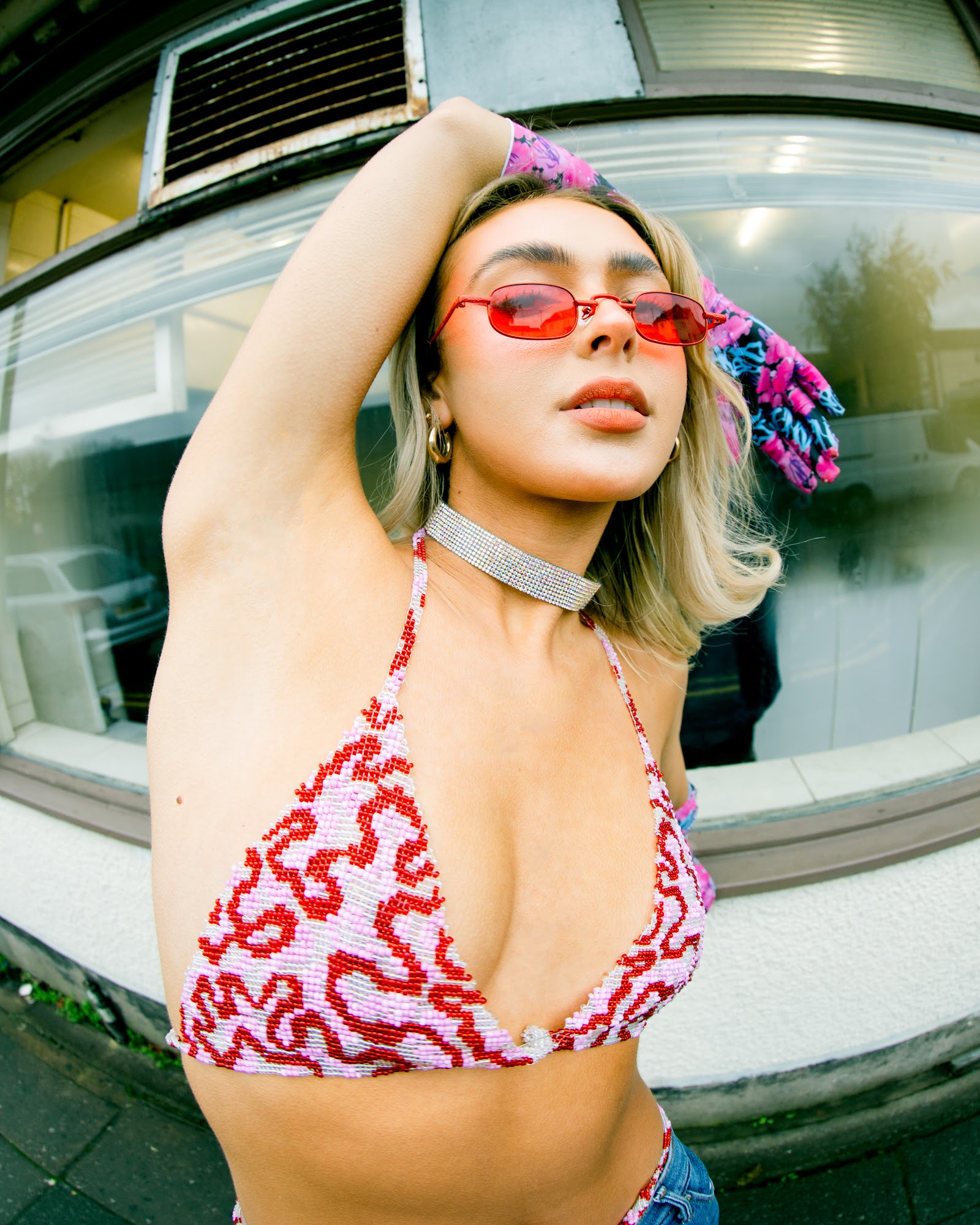
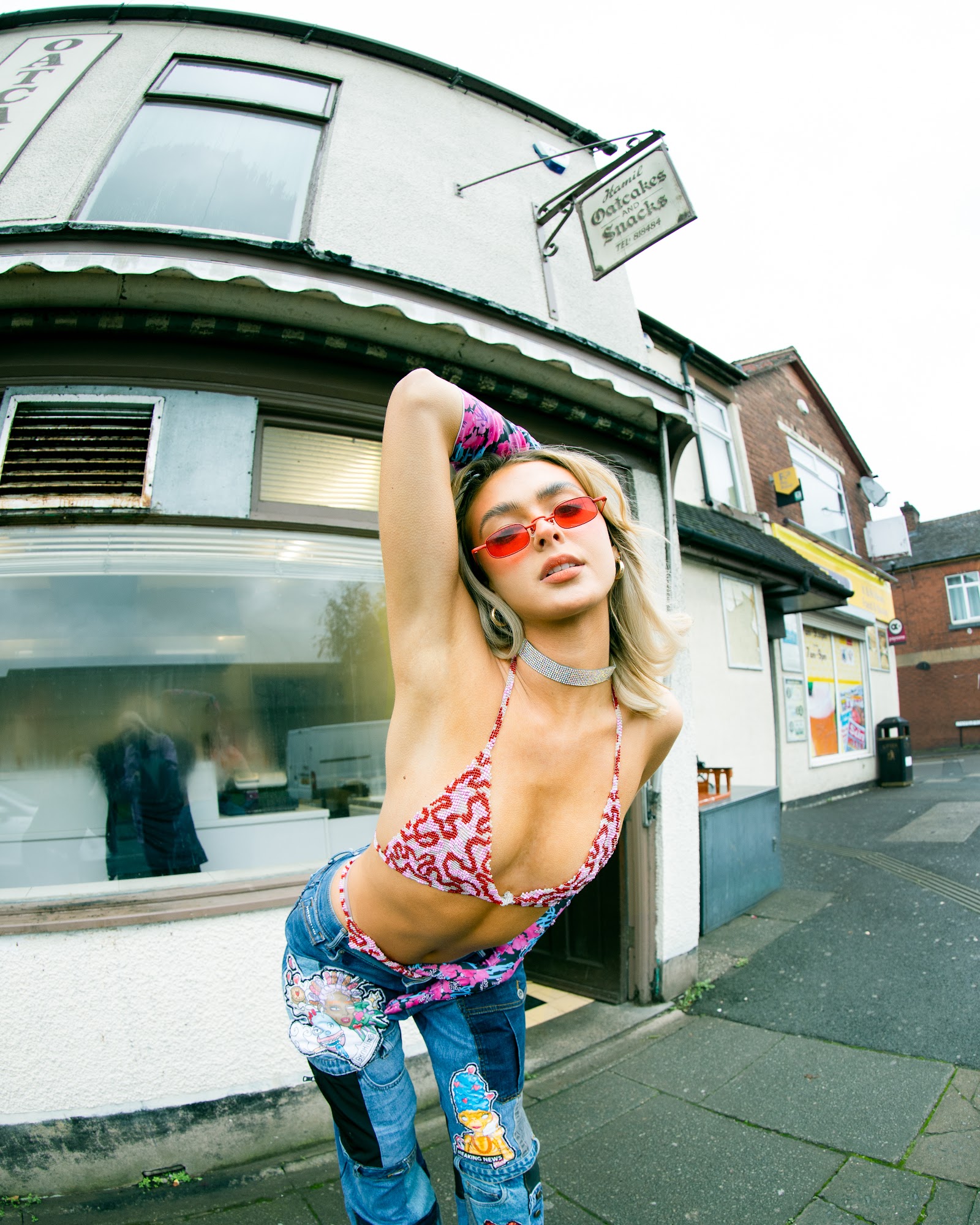
Set against British residential streets, it captured party-girl sensibility with beaded-detail bikini tops and Y2K sunglasses through wide-angle lenses, blurring the line between street documentary and fashion editorial.
What is the primary color palette used in this editorial?
A compressed palette of pink, red, and denim blue was used, with cloudy natural light creating a soft filter effect.