9 more of 11 images
This editorial opens with a PREMIUM membership
STANDARD currently covers editorials published since 2026.04
PREMIUM · the full archive since 2019
See membershipPREMIUM · the full archive since 2019
DOWNLOADS
Cover and logo image downloads are for Standard members.
Contributing creators: the tearsheet and hi-res images of your own editorial are included from Standard (€5.49/mo).
Contributing creators: the tearsheet and hi-res images of your own editorial are included from Standard (€5.49/mo).
Personal, non-commercial use only
FAQ
What is the color palette for the THINGS NOT TO THINK editorial?
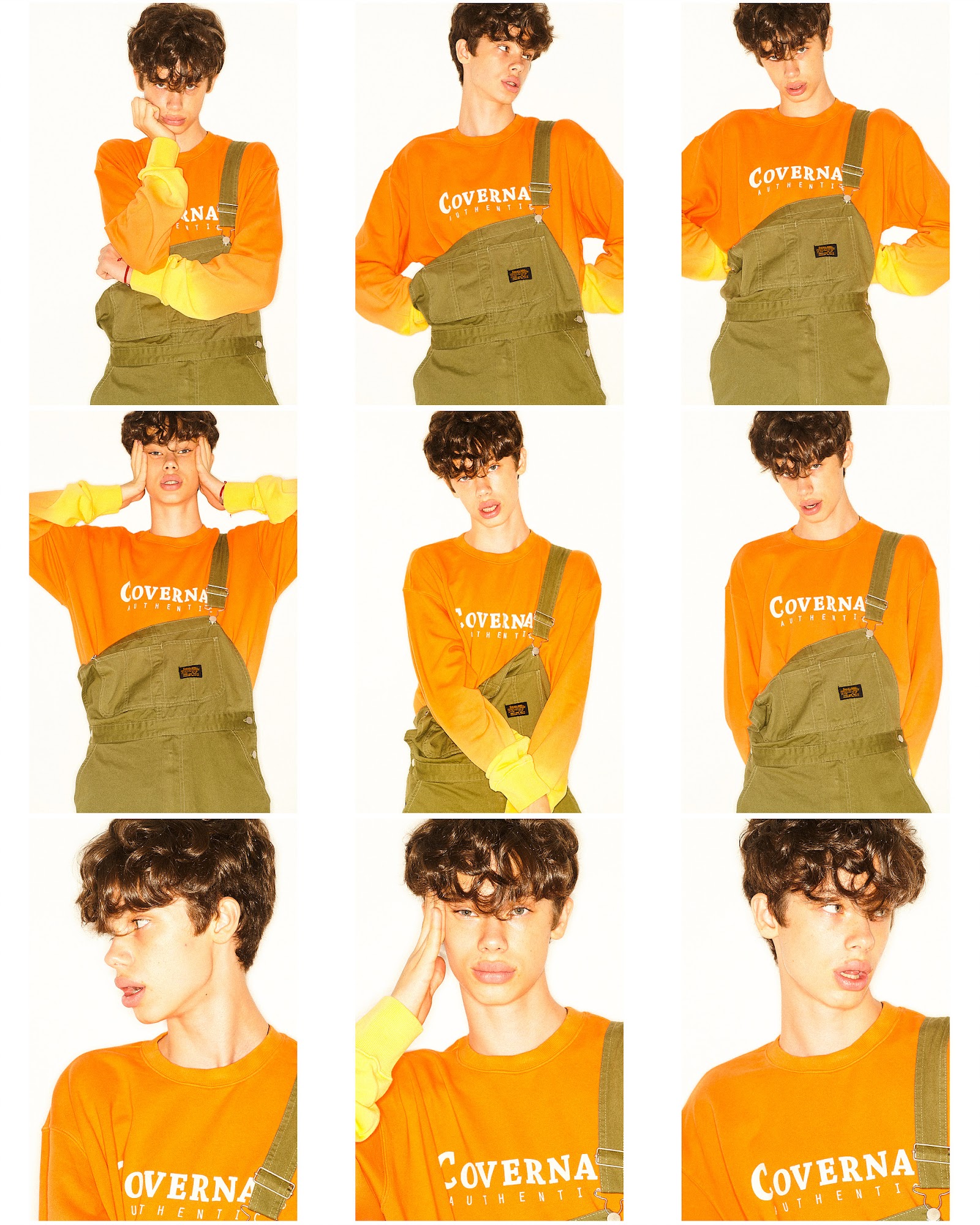
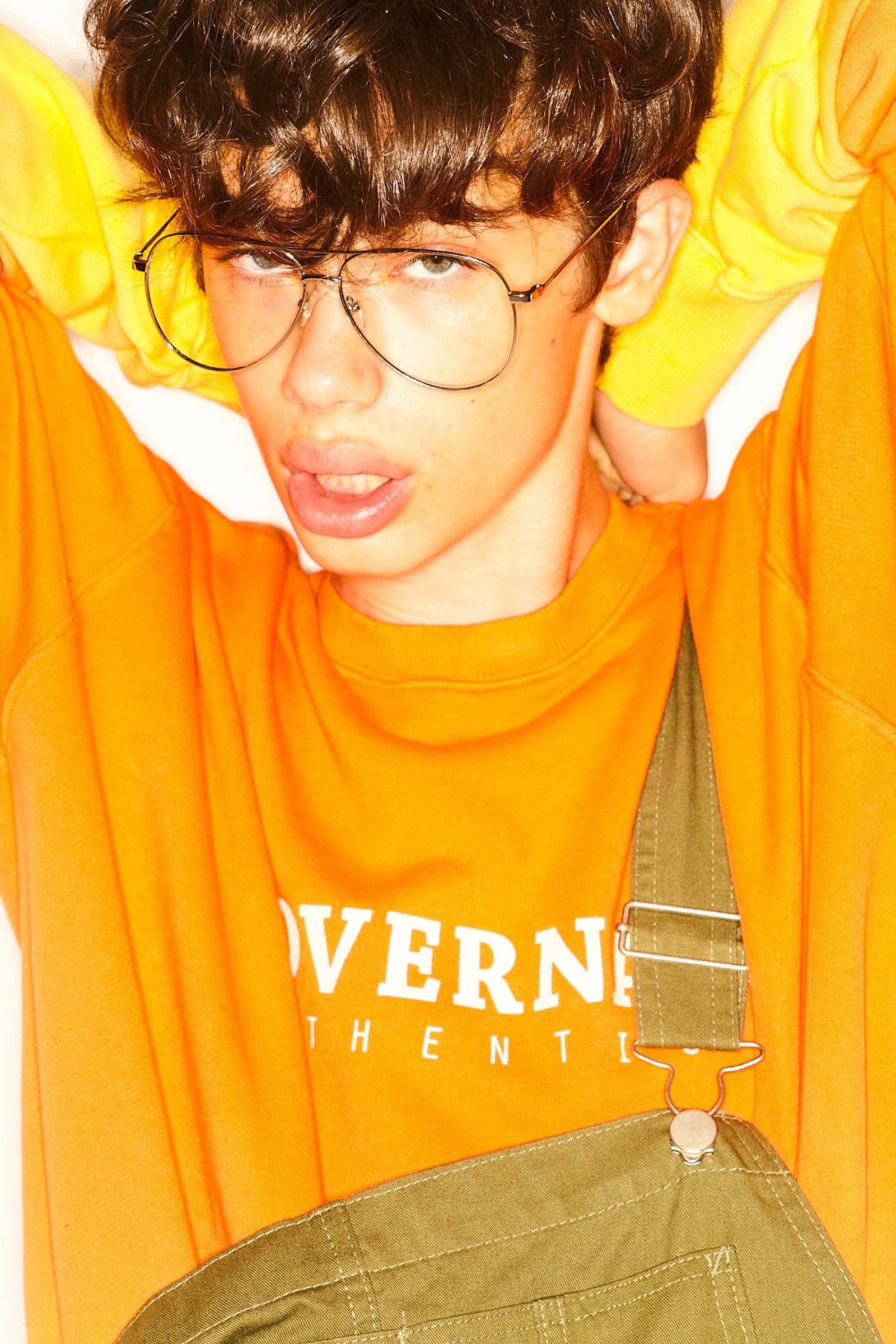
Three clashing colors—orange, lemon yellow, and khaki green—meet in a Coverna Authentic logo orange crewneck sweatshirt, olive-green overalls, and yellow layered sleeves that create a gradient effect.
What style mood does this editorial express?
Colorblocking that crosses nineties skate culture with workwear, a style declaration rejecting complex thought for pure sensation, visualizing inner noise through utility details and exaggerated gestures.