13 more of 15 images
This editorial opens with a PREMIUM membership
STANDARD currently covers editorials published since 2026.04
PREMIUM · the full archive since 2019
See membershipPREMIUM · the full archive since 2019
DOWNLOADS
Cover and logo image downloads are for Standard members.
Contributing creators: the tearsheet and hi-res images of your own editorial are included from Standard (€5.49/mo).
Contributing creators: the tearsheet and hi-res images of your own editorial are included from Standard (€5.49/mo).
Personal, non-commercial use only
FAQ
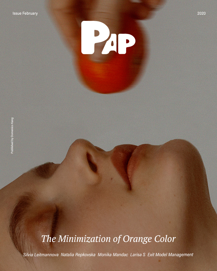
What's the concept behind THE MINIMIZATION OF ORANGE COLOR?
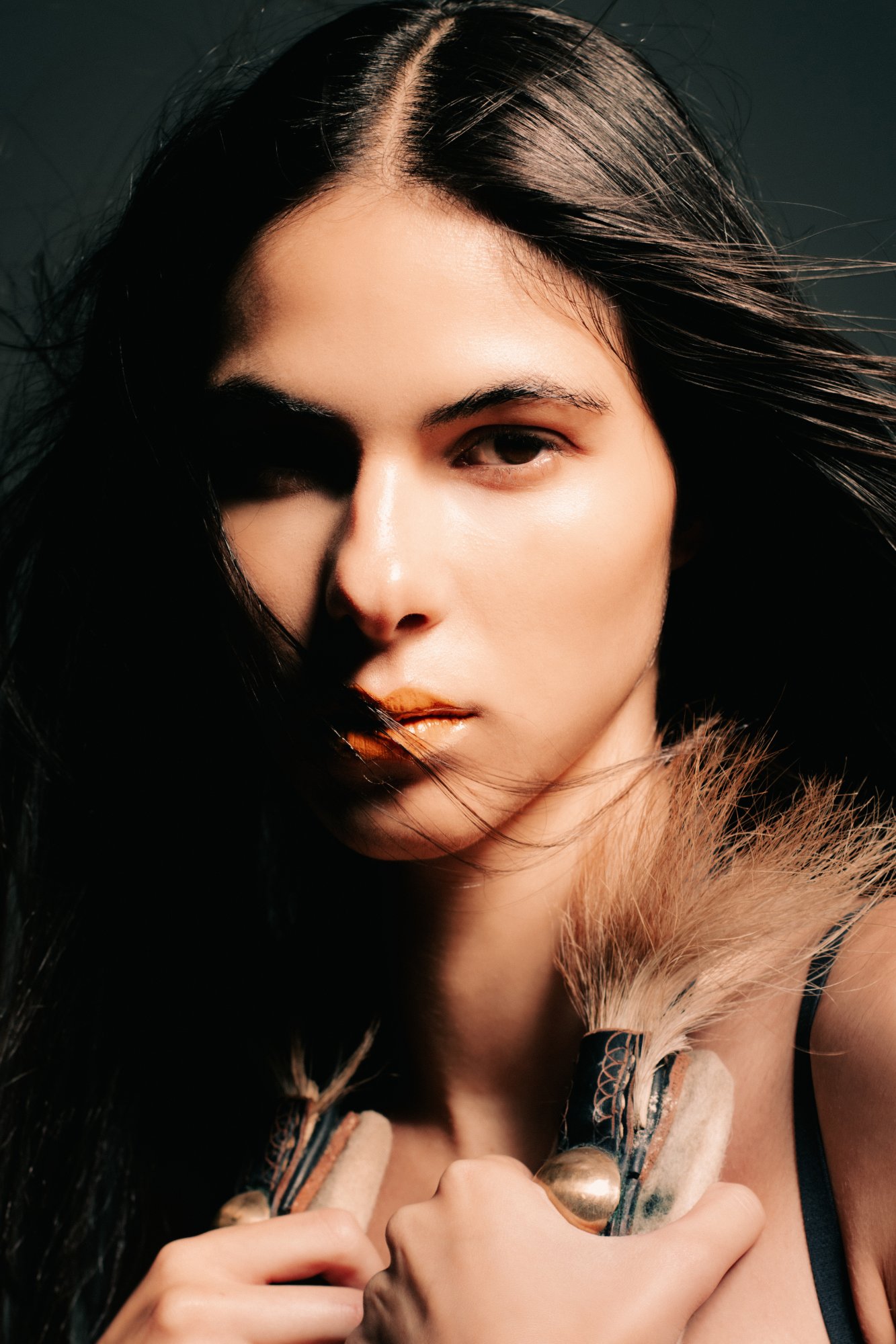
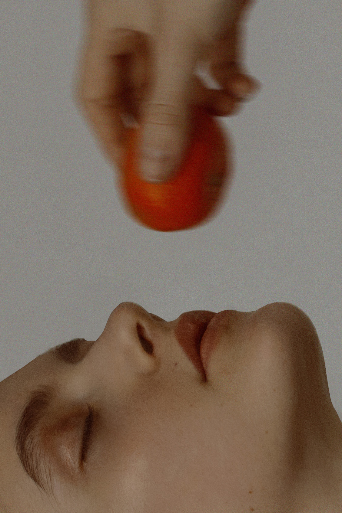
It demonstrates a minimalist strategy by condensing color into a single point—orange applied only to the lips. Against a gray neutral background and nearly achromatic skin, the coral-orange lip becomes the sole chromatic focal point.
How is THE MINIMIZATION OF ORANGE COLOR structured?
It captures extreme close-ups of Exit Model Management models' faces or presents intentionally blurred, motion-shaken images. The editorial departs from conventional beauty photography, approaching something closer to conceptual still life.