10 more of 12 images
This editorial opens with a PREMIUM membership
STANDARD currently covers editorials published since 2026.04
PREMIUM · the full archive since 2019
See membershipPREMIUM · the full archive since 2019
DOWNLOADS
Cover and logo image downloads are for Standard members.
Contributing creators: the tearsheet and hi-res images of your own editorial are included from Standard (€5.49/mo).
Contributing creators: the tearsheet and hi-res images of your own editorial are included from Standard (€5.49/mo).
Personal, non-commercial use only
FAQ
How is the color composition structured in the ORANGE BALANCE editorial?
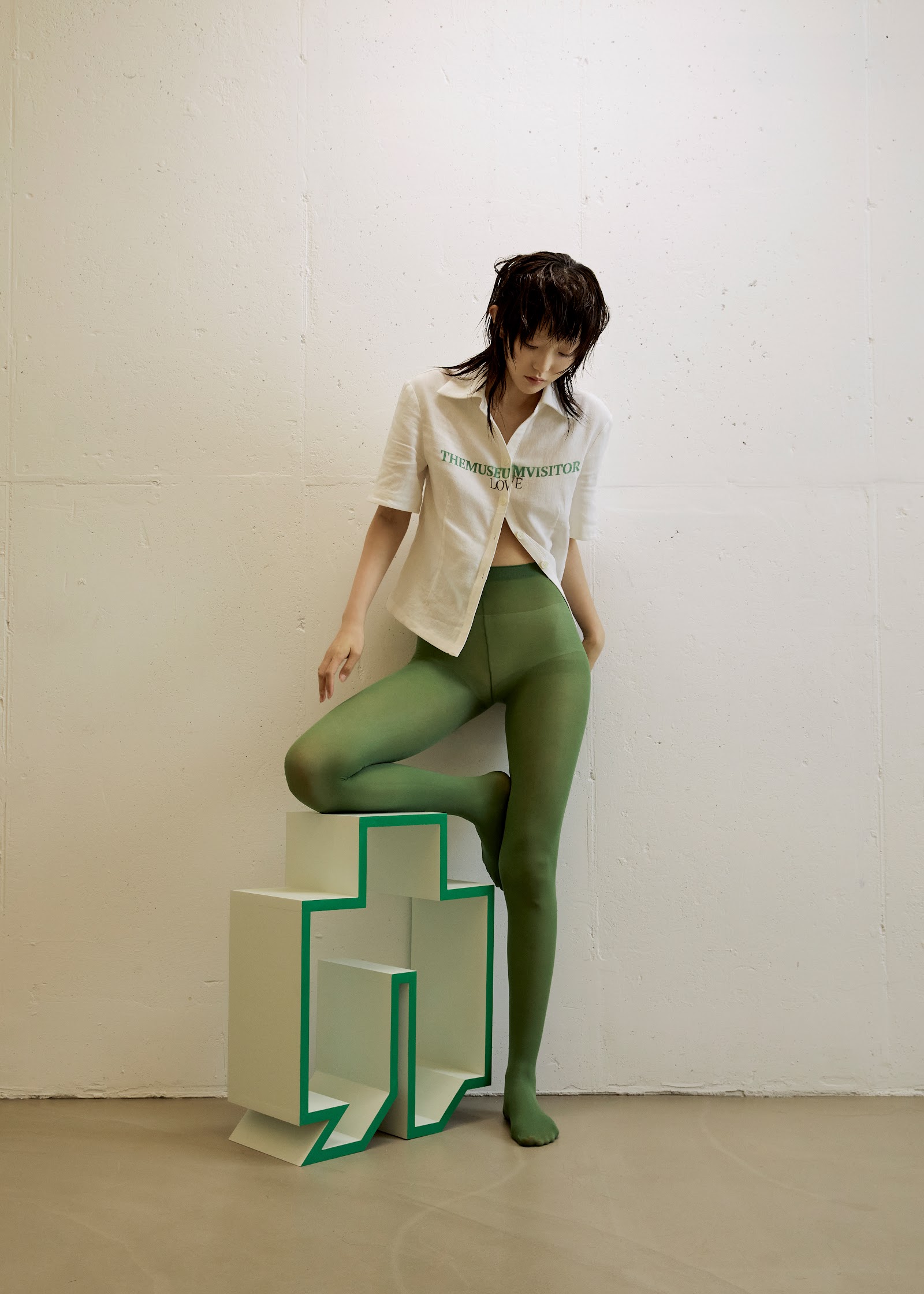
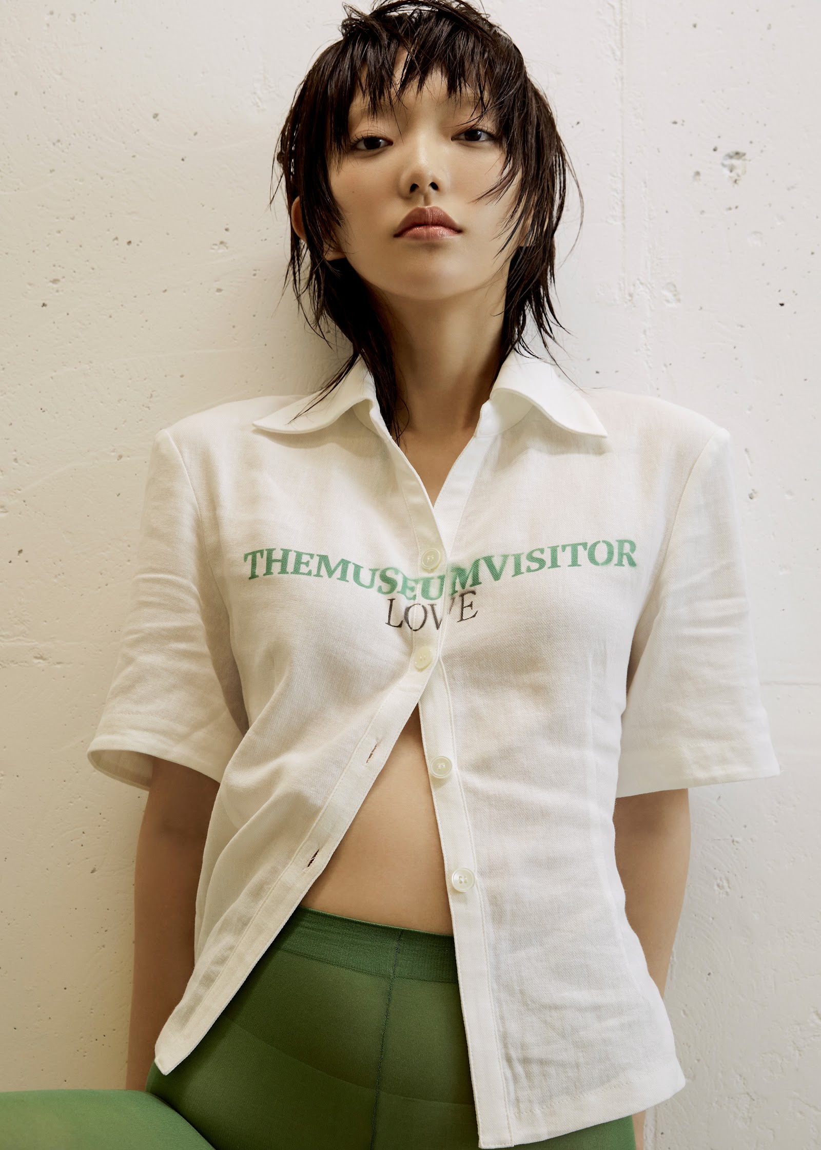
Olive green tights, cream shirts, ivory block structures, and emerald green borders complete an ivory-olive-emerald three-tone palette, while the title's 'orange' leaves its resonance through absence.
What art-historical references does this editorial contain?
The MUSEUM VISITOR LOVE typography shirt, green-trimmed stepped block sculptures, and matte color-field compositions evoke sixties modernist graphics while firmly planting feet in contemporary minimalism.