7 more of 9 images
This editorial opens with a PREMIUM membership
STANDARD currently covers editorials published since 2026.04
PREMIUM · the full archive since 2019
See membershipPREMIUM · the full archive since 2019
DOWNLOADS
Cover and logo image downloads are for Standard members.
Contributing creators: the tearsheet and hi-res images of your own editorial are included from Standard (€5.49/mo).
Contributing creators: the tearsheet and hi-res images of your own editorial are included from Standard (€5.49/mo).
Personal, non-commercial use only
FAQ
What's the styling concept behind the MATCHI editorial?
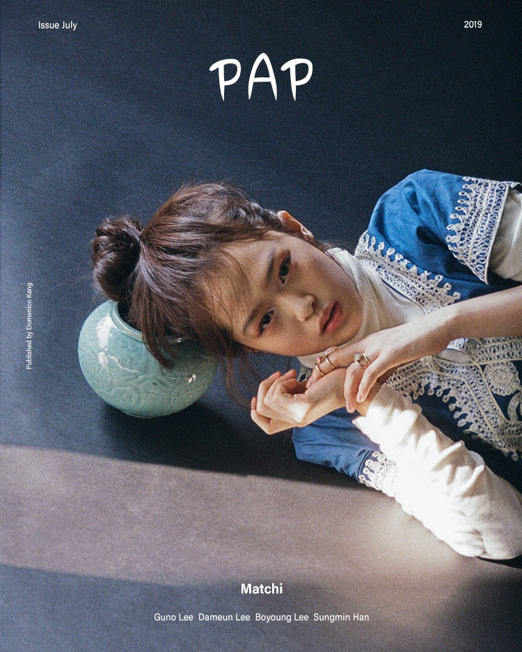
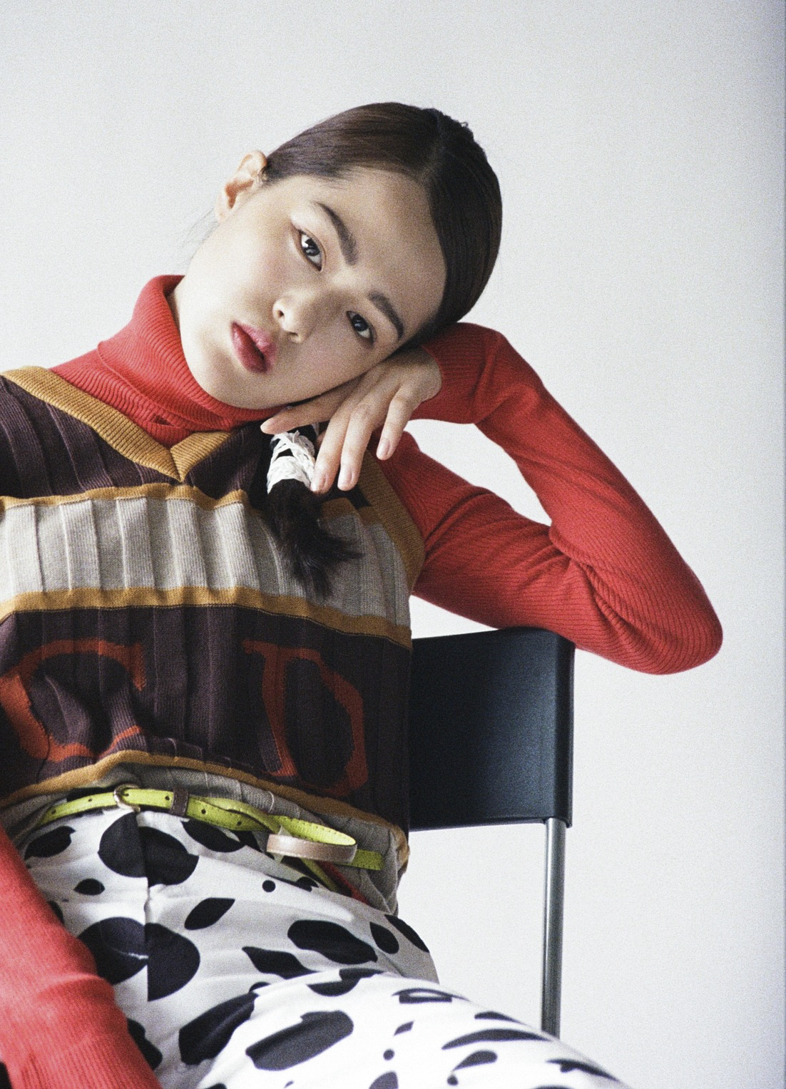
The concept is fearless mixing—layering denim over blue and ivory lace details, pairing a coral red top with striped knitwear, and clashing patterns with polka-dot bottoms. It's harmony through collision, visualizing color and texture without hesitation.
Which textures are emphasized in the MATCHI shoot?
The ribbed structure of knits, transparency of lace, and rough surface of denim all come alive against the studio backdrop. Vintage craft sensibility and organic accessory layering complete the overall textural narrative with clarity and depth.