9 more of 11 images
This editorial opens with a PREMIUM membership
STANDARD currently covers editorials published since 2026.04
PREMIUM · the full archive since 2019
See membershipPREMIUM · the full archive since 2019
DOWNLOADS
Cover and logo image downloads are for Standard members.
Contributing creators: the tearsheet and hi-res images of your own editorial are included from Standard (€5.49/mo).
Contributing creators: the tearsheet and hi-res images of your own editorial are included from Standard (€5.49/mo).
Personal, non-commercial use only
FAQ
What color palette does the INSIDE editorial use?
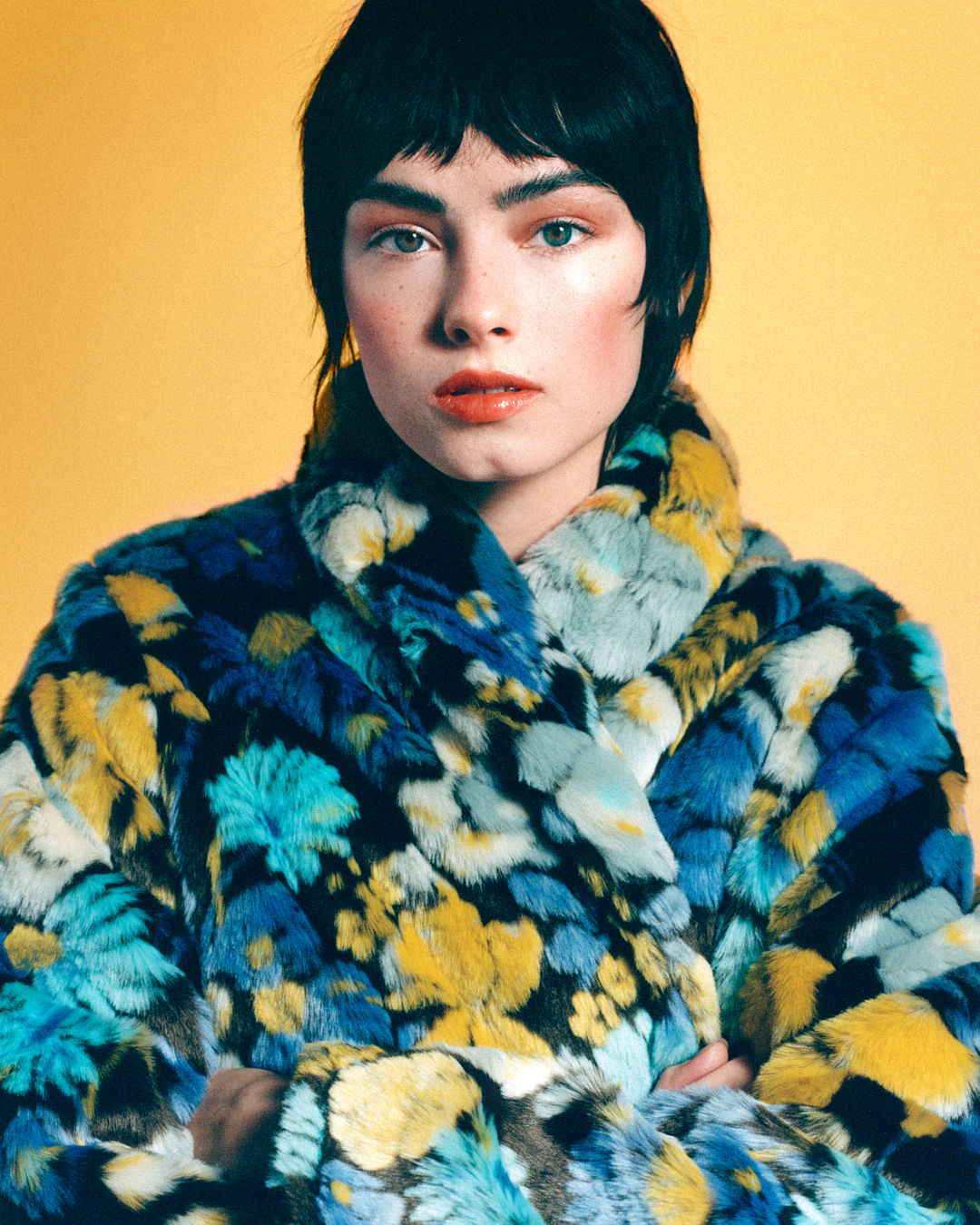
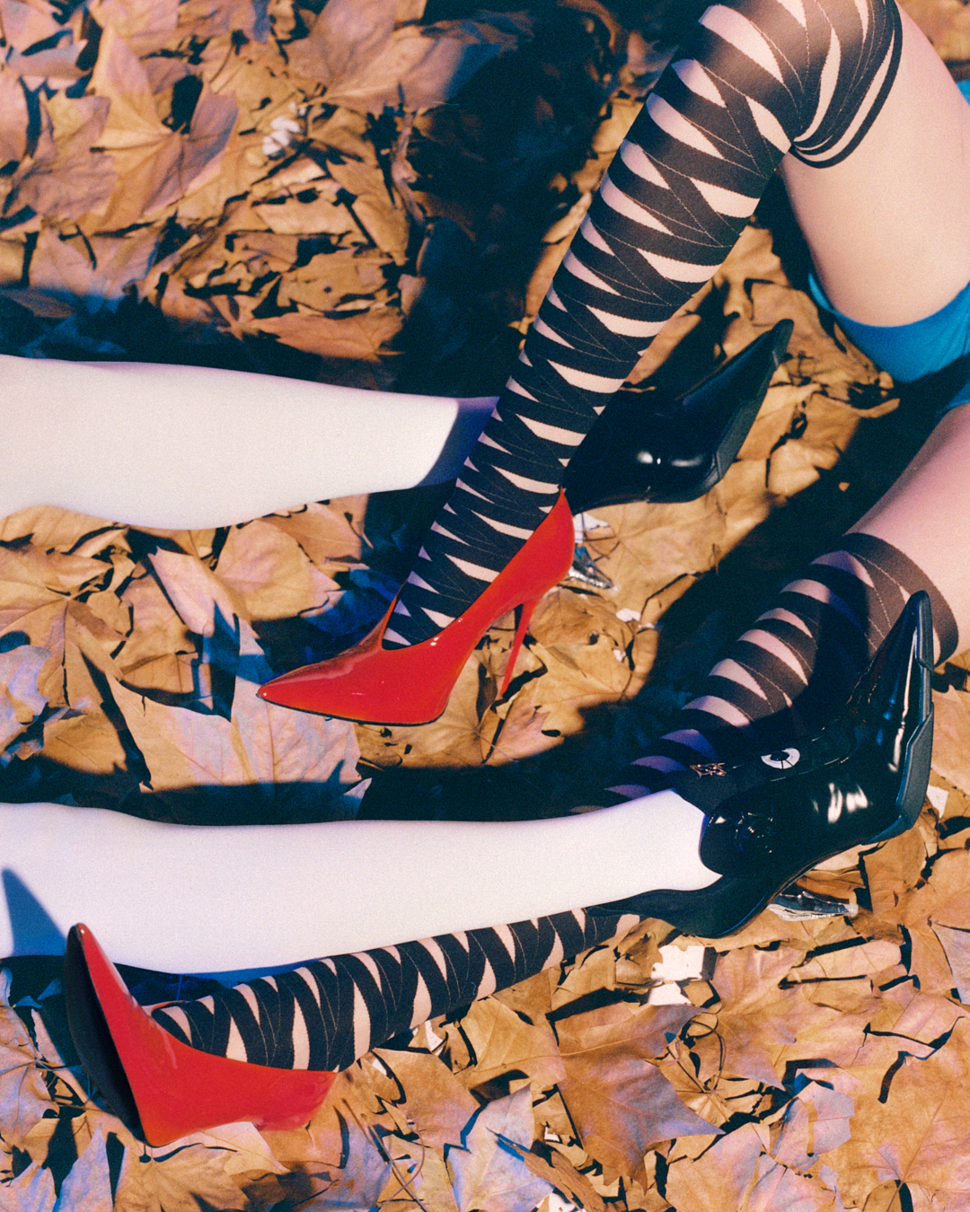
Centered on a fur coat exploding with teal blue and electric yellow, mustard walls, black base, and lacquer red pointed pumps construct a bold color-block palette intersecting seventies poster art with contemporary graphic fashion.
How is texture emphasized in this editorial?
The directionality of fur, stretch of knit, and shine of shoes are highlighted through close-ups, with the gaze flowing from top to bottom following each material's tactile quality.