15 more of 17 images
This editorial opens with a PREMIUM membership
STANDARD currently covers editorials published since 2026.04
PREMIUM · the full archive since 2019
See membershipPREMIUM · the full archive since 2019
DOWNLOADS
Cover and logo image downloads are for Standard members.
Contributing creators: the tearsheet and hi-res images of your own editorial are included from Standard (€5.49/mo).
Contributing creators: the tearsheet and hi-res images of your own editorial are included from Standard (€5.49/mo).
Personal, non-commercial use only
FAQ
What message does the HOW TO BE PRETTY editorial convey?
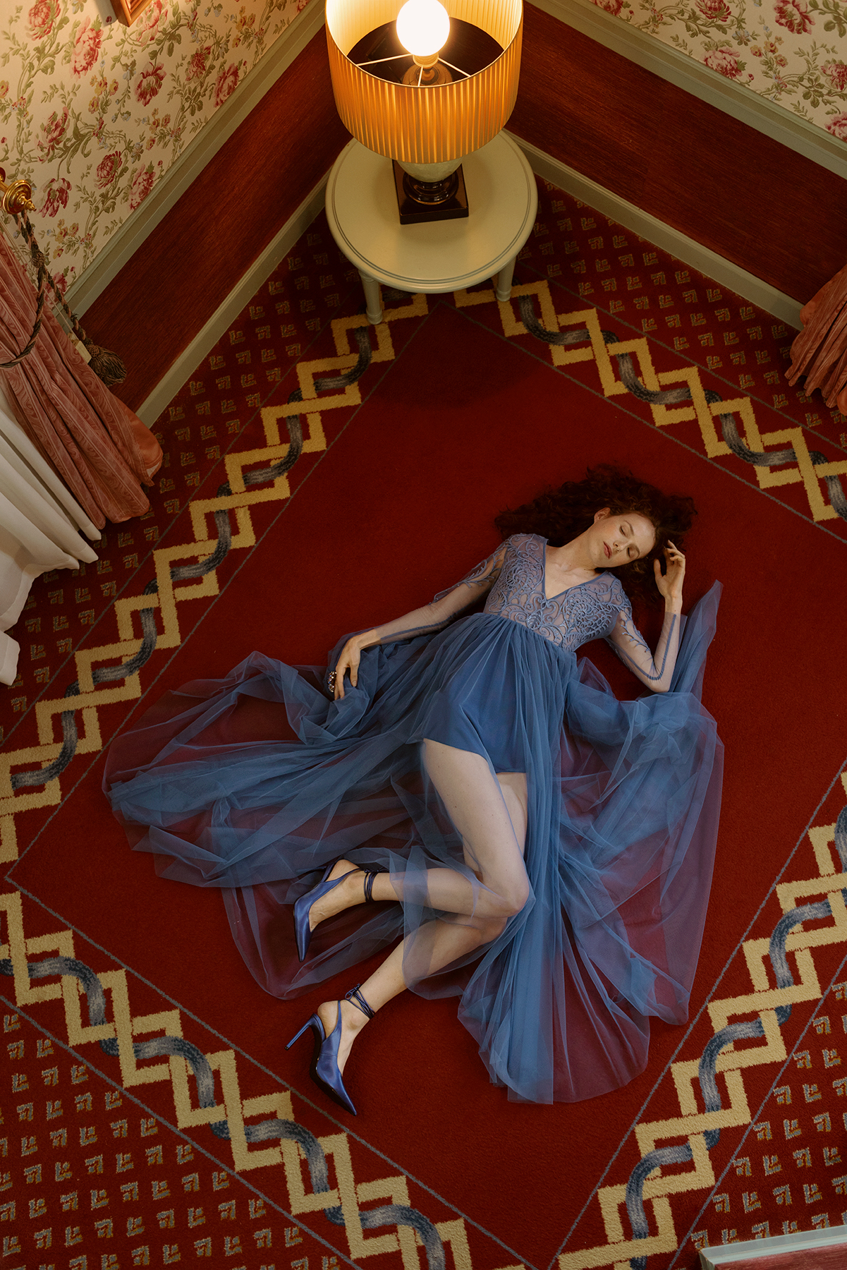
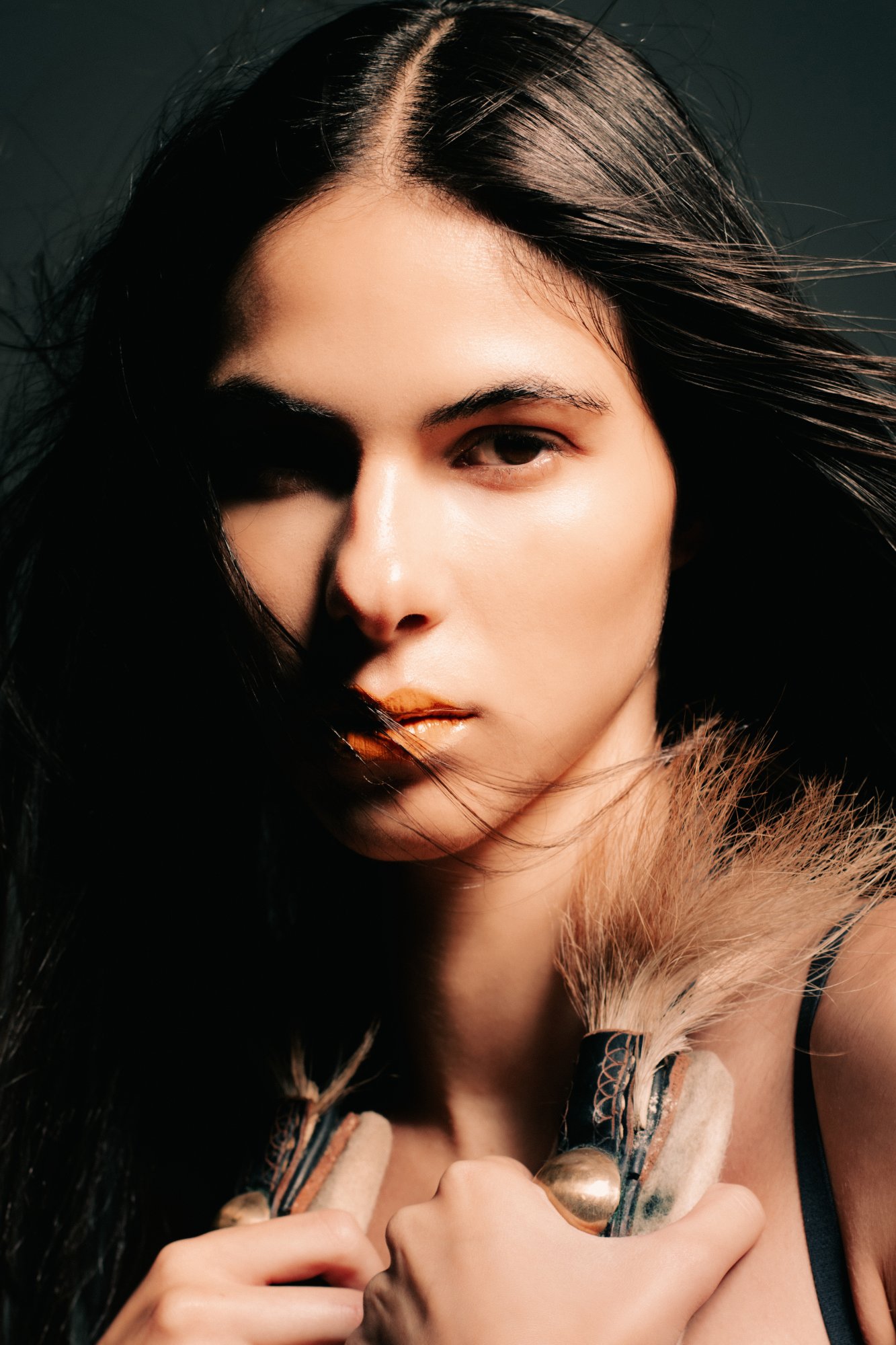
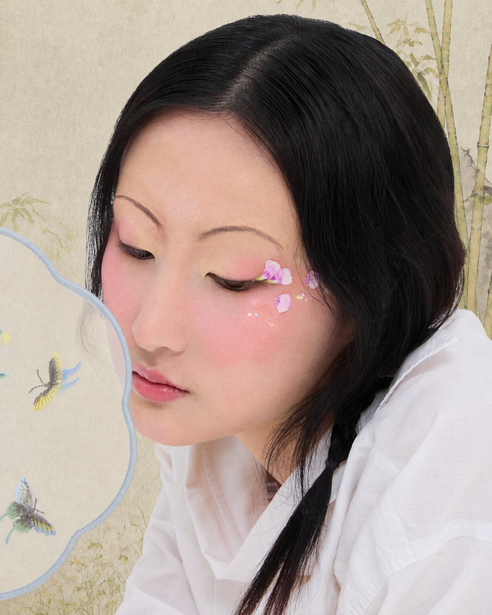
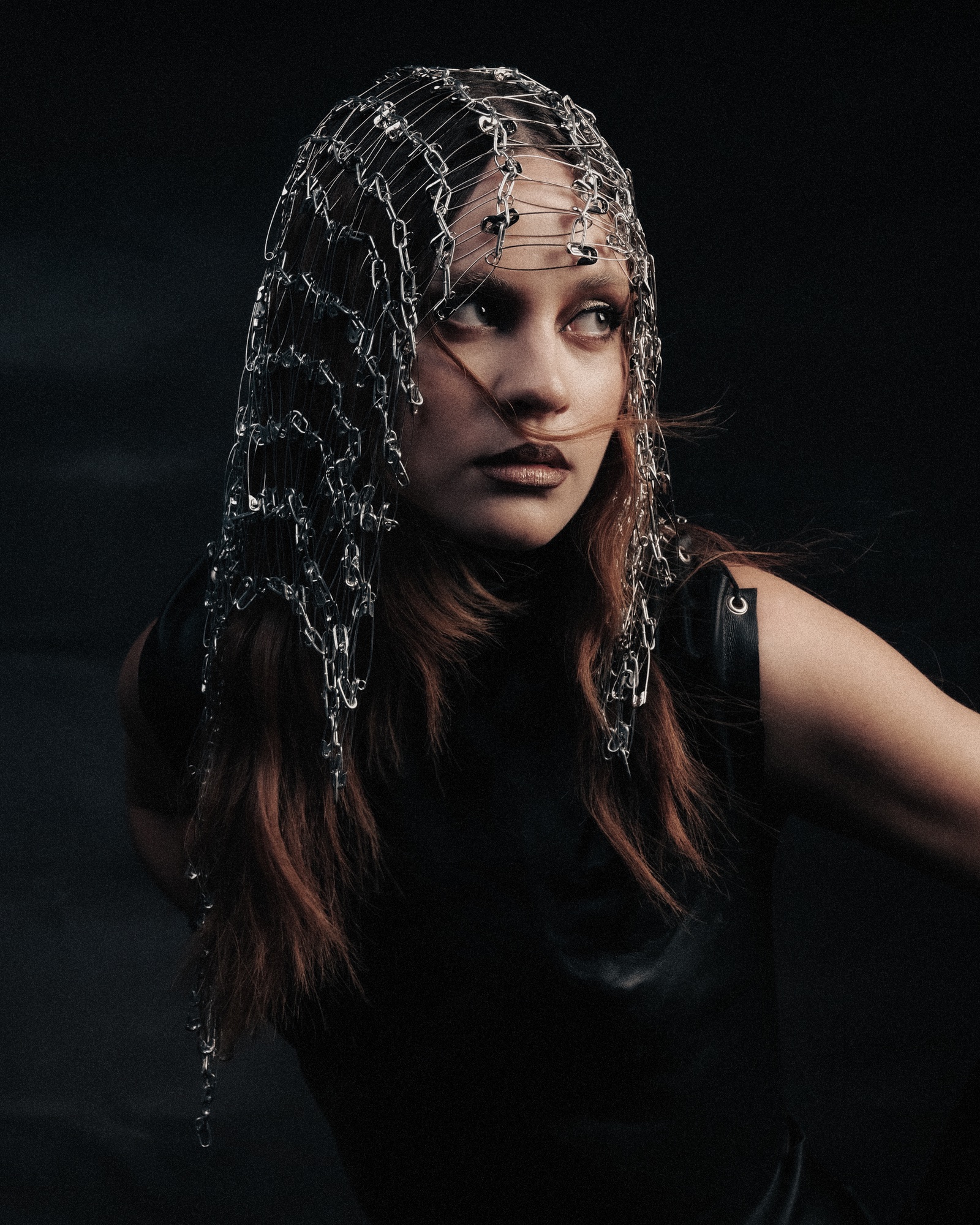
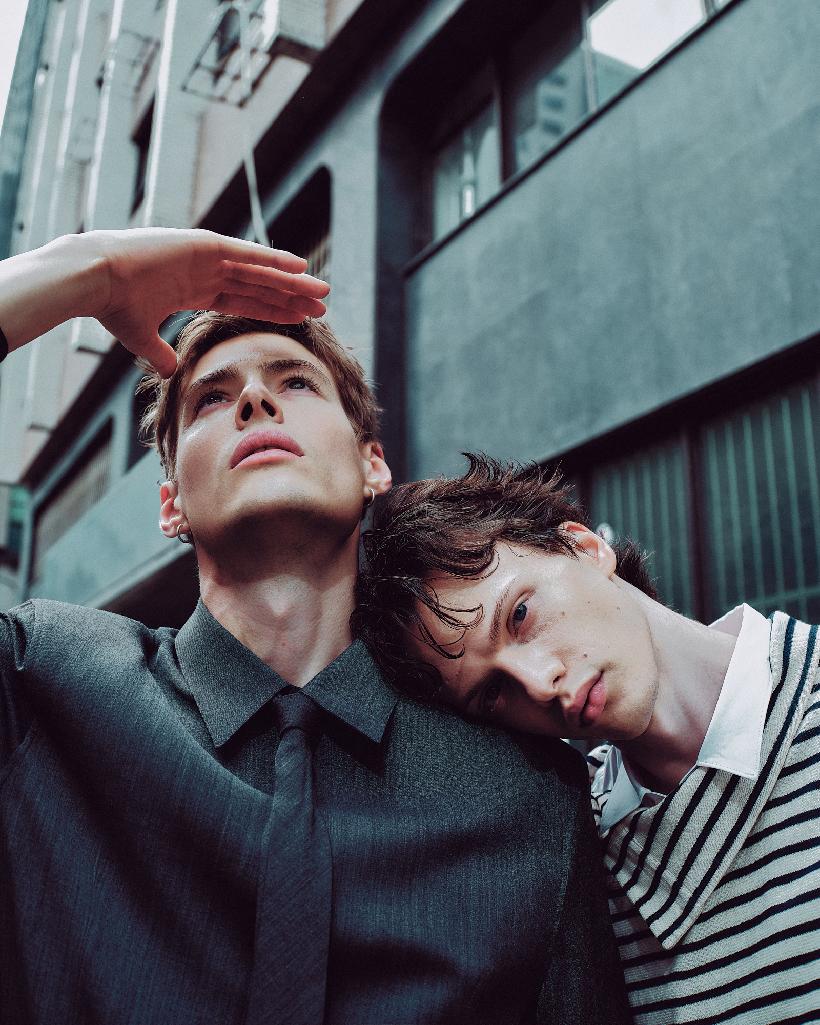
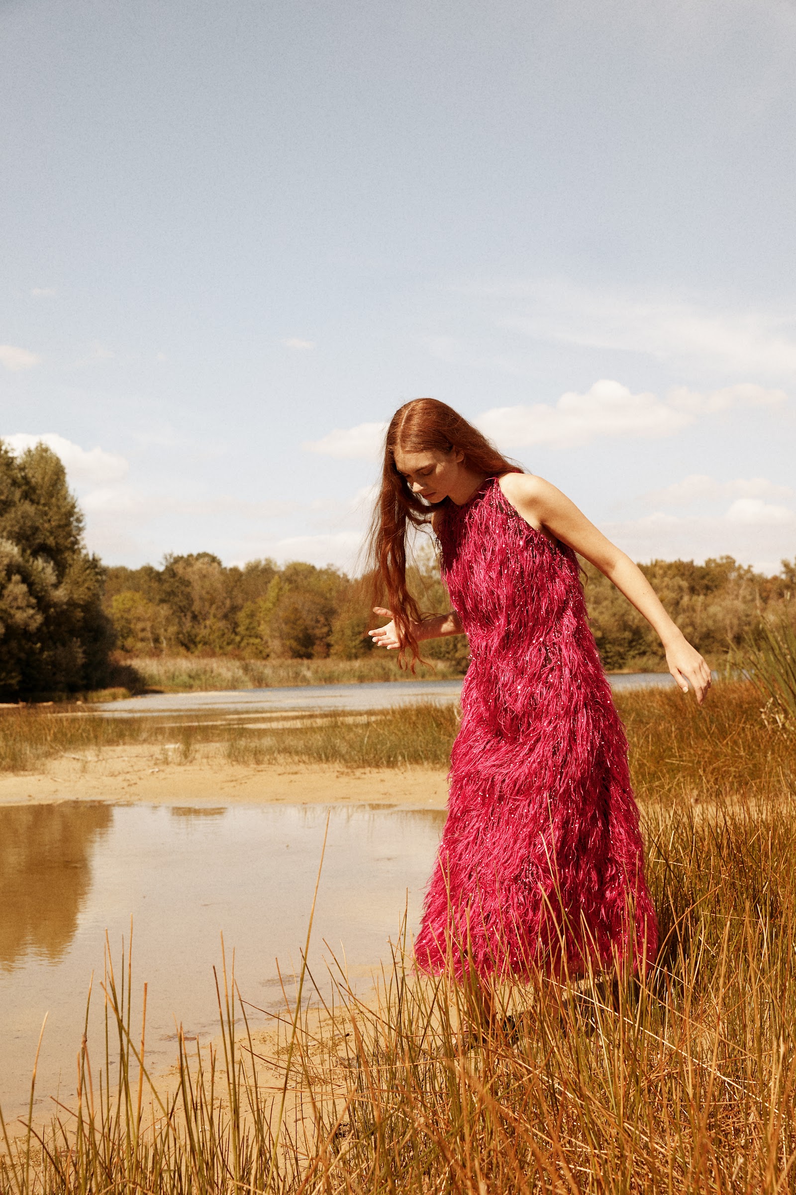
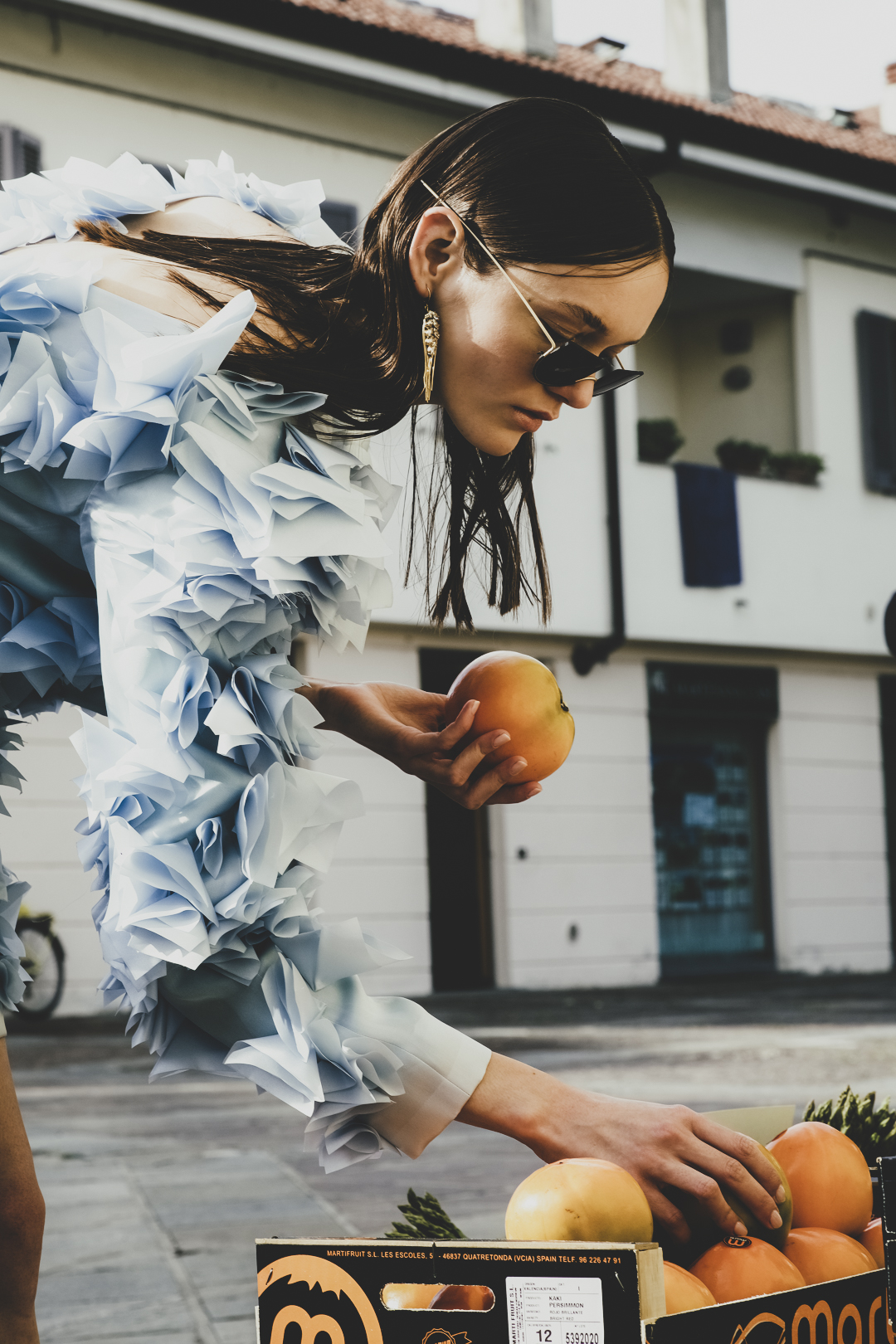
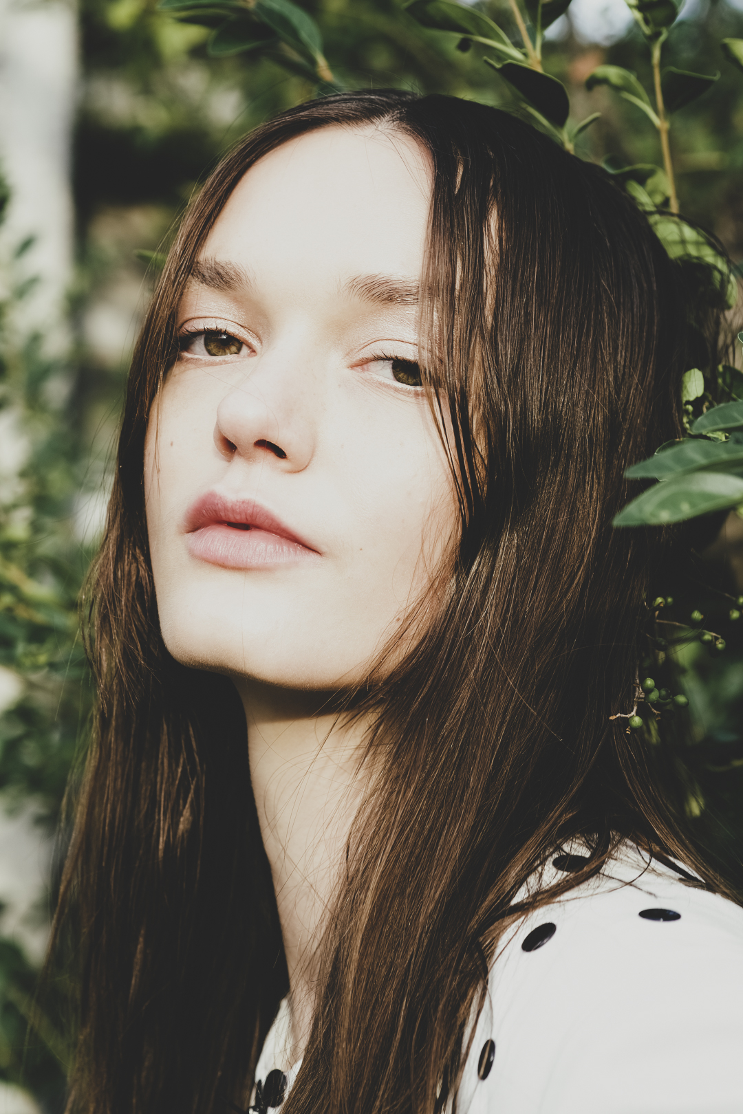
It answers the question 'What is beauty?' through the most ordinary moments, juxtaposing artificial composition with natural light, dramatic structure with humble objects, suggesting prettiness is discovered, not defined.
What details appear in the HOW TO BE PRETTY editorial?
Layered ice-blue ruffles, sculptural paper-frill sleeves, and sheer transparent sleeves feature prominently. Metallic ear cuffs and geometric sunglasses frame the face, creating dimensional volume.