7 more of 9 images
This editorial opens with a PREMIUM membership
STANDARD currently covers editorials published since 2026.04
PREMIUM · the full archive since 2019
See membershipPREMIUM · the full archive since 2019
DOWNLOADS
Cover and logo image downloads are for Standard members.
Contributing creators: the tearsheet and hi-res images of your own editorial are included from Standard (€5.49/mo).
Contributing creators: the tearsheet and hi-res images of your own editorial are included from Standard (€5.49/mo).
Personal, non-commercial use only
FAQ
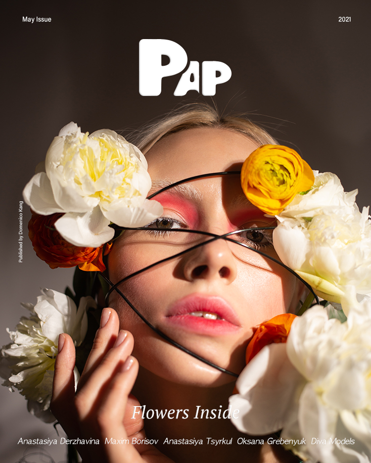
FLOWERS INSIDE 화보는 어떤 꽃과 색채를 사용했나요?
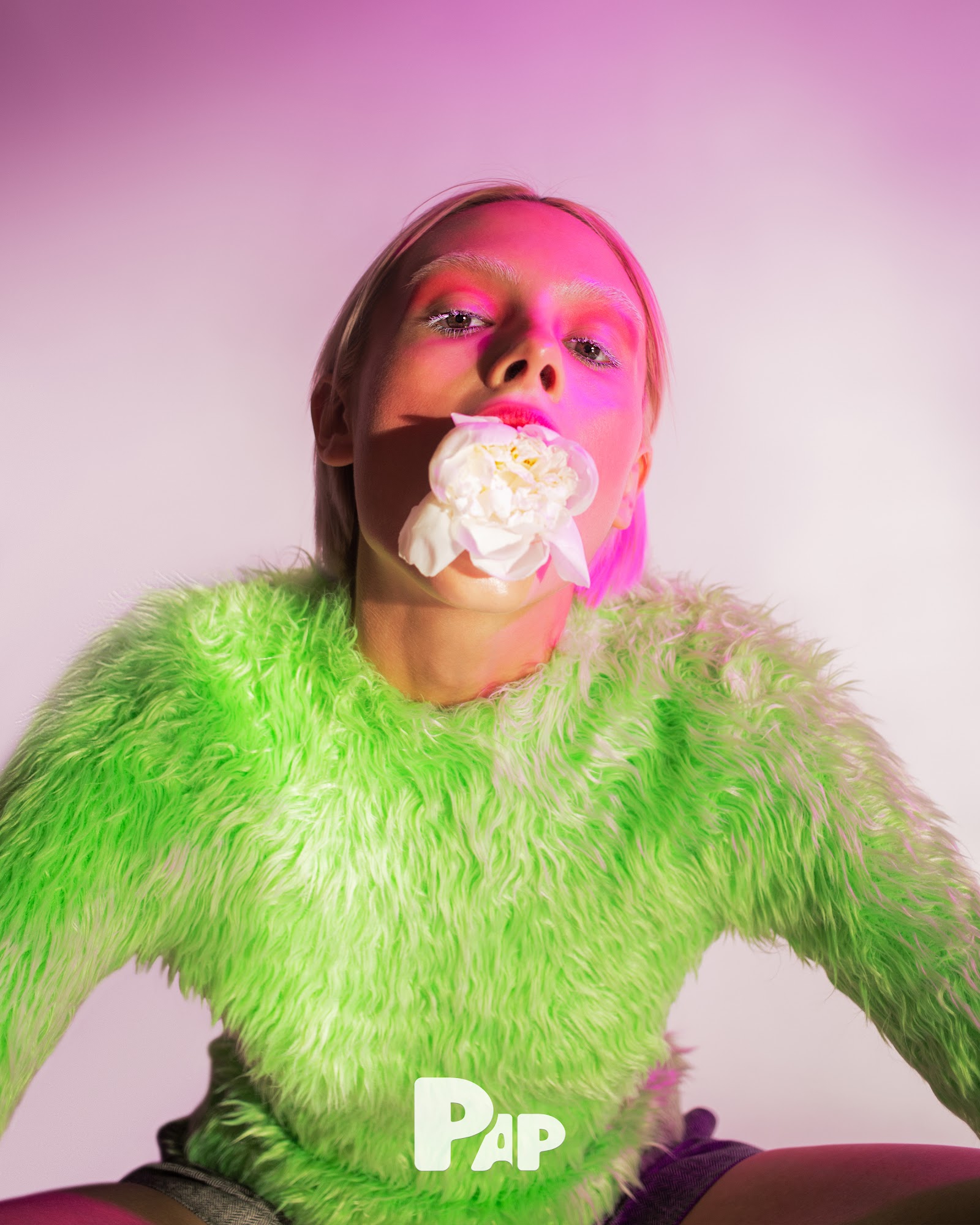
Ivory and golden yellow ranunculus and peonies were placed directly on skin, paired with red and coral eyeshadow clashing against petal tones, while a neon green fur jacket and pink-purple lighting maximized chromatic impact.
이 화보의 콘셉트와 연출 방식은 무엇인가요?
Blurring beauty and botanical, black stems crossed faces like masks. Natural materials were trapped in artificial light and texture against neutral or pastel gradient studio backdrops—an experimental approach that challenged traditional boundaries.