10 more of 12 images
This editorial opens with a PREMIUM membership
STANDARD currently covers editorials published since 2026.04
PREMIUM · the full archive since 2019
See membershipPREMIUM · the full archive since 2019
DOWNLOADS
Cover and logo image downloads are for Standard members.
Contributing creators: the tearsheet and hi-res images of your own editorial are included from Standard (€5.49/mo).
Contributing creators: the tearsheet and hi-res images of your own editorial are included from Standard (€5.49/mo).
Personal, non-commercial use only
FAQ
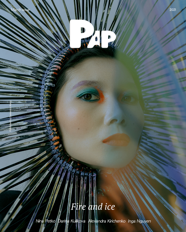
Who worked on the FIRE AND ICE editorial?
Nina Petko, Darina Kulikova, Alexandra Kirichenko, and Inga Nguyen collaborated on this avant-garde beauty visual, featured in the December 2021 issue.
What is the concept of FIRE AND ICE?
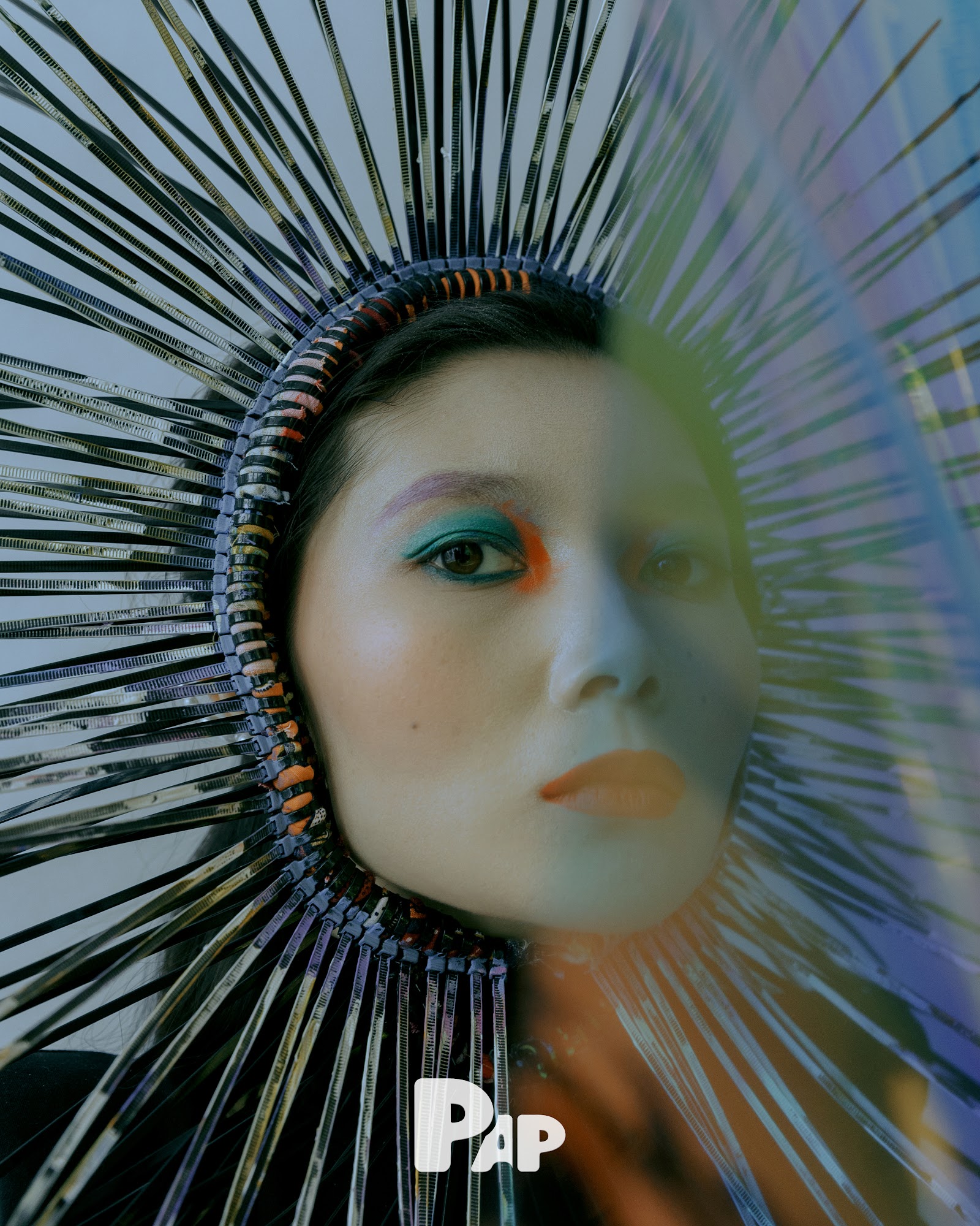
It addresses the aesthetics of opposition where cold metallic silver and hot orange collide, translating temperature difference into visual language through radial spike headpieces and intense orange makeup.
What sculptural elements were used in FIRE AND ICE?
Textured metal strips reflect light creating geometric halos, while green palm leaves in the background blur boundaries between tropical and futuristic, organic and inorganic.
%22%2F%3E%3Ctext%20x%3D%22200%22%20y%3D%22250%22%20text-anchor%3D%22middle%22%20fill%3D%22rgba(255%2C255%2C255%2C0.2)%22%20font-family%3D%22sans-serif%22%20font-size%3D%2213%22%20font-weight%3D%22bold%22%20letter-spacing%3D%222%22%3EETERNAL%20CARNIVAL%3C%2Ftext%3E%3Ctext%20x%3D%22200%22%20y%3D%22275%22%20text-anchor%3D%22middle%22%20fill%3D%22rgba(255%2C255%2C255%2C0.1)%22%20font-family%3D%22sans-serif%22%20font-size%3D%2210%22%20letter-spacing%3D%223%22%3EPAP%20MAGAZINE%3C%2Ftext%3E%3C%2Fsvg%3E)