11 more of 13 images
This editorial opens with a PREMIUM membership
STANDARD currently covers editorials published since 2026.04
PREMIUM · the full archive since 2019
See membershipPREMIUM · the full archive since 2019
DOWNLOADS
Cover and logo image downloads are for Standard members.
Contributing creators: the tearsheet and hi-res images of your own editorial are included from Standard (€5.49/mo).
Contributing creators: the tearsheet and hi-res images of your own editorial are included from Standard (€5.49/mo).
Personal, non-commercial use only
FAQ
What is the concept of the COLD SUMMER editorial?
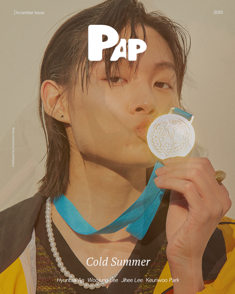
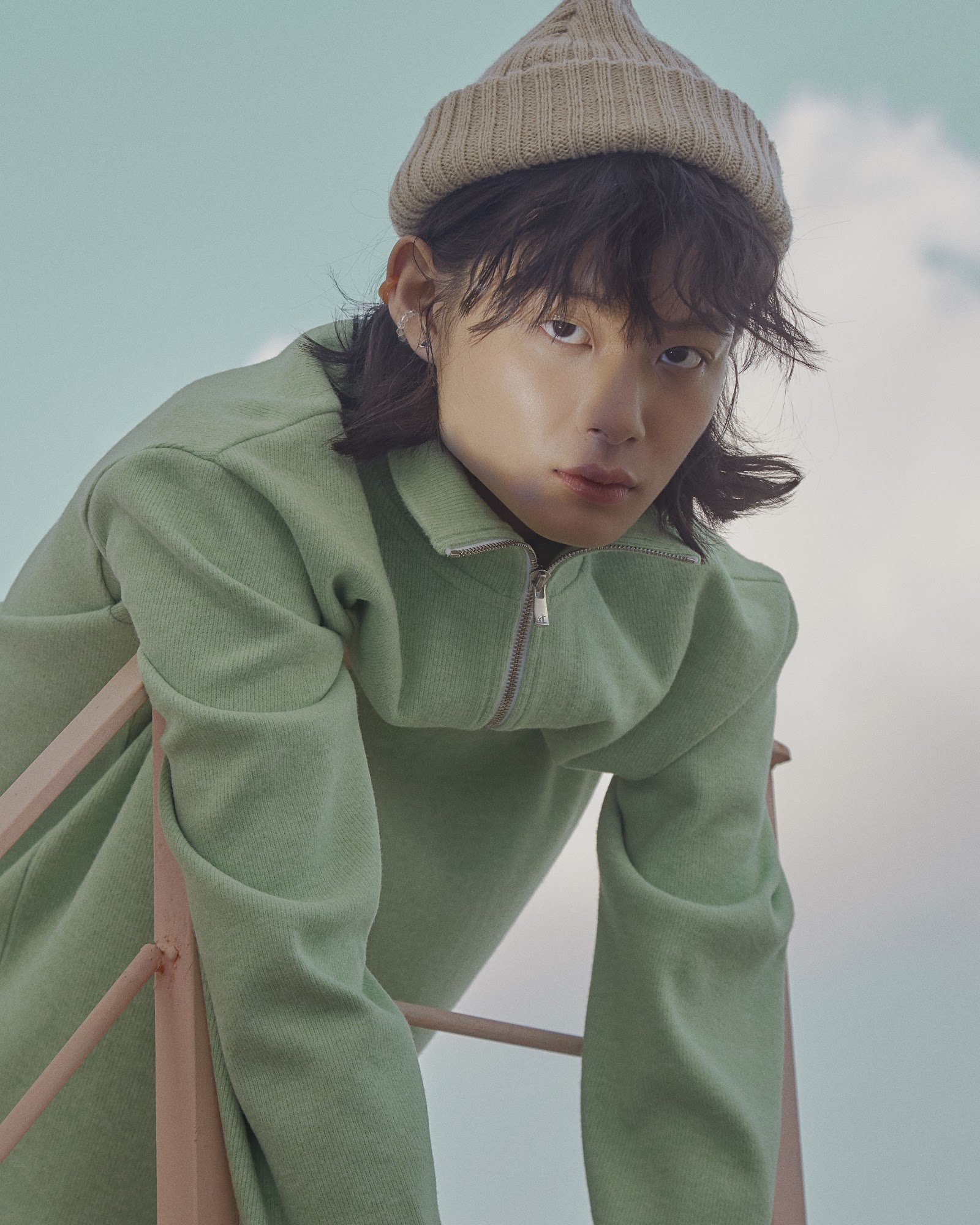
An editorial that rejects summer heat, armed with cool gazes and chill sensibility. It betrays seasonal expectations, proposing crisp attitude instead of warmth.
How is the color palette composed in the COLD SUMMER editorial?
The first look features colliding turquoise blue ribbons, black jackets, and yellow color-blocking; the second introduces sage green zip-ups and beige knit beanies. The overall palette converges toward near-neutral pastel tones.
%22%2F%3E%3Ctext%20x%3D%22200%22%20y%3D%22250%22%20text-anchor%3D%22middle%22%20fill%3D%22rgba(255%2C255%2C255%2C0.2)%22%20font-family%3D%22sans-serif%22%20font-size%3D%2213%22%20font-weight%3D%22bold%22%20letter-spacing%3D%222%22%3EFLOATING%20ALICIA%3C%2Ftext%3E%3Ctext%20x%3D%22200%22%20y%3D%22275%22%20text-anchor%3D%22middle%22%20fill%3D%22rgba(255%2C255%2C255%2C0.1)%22%20font-family%3D%22sans-serif%22%20font-size%3D%2210%22%20letter-spacing%3D%223%22%3EPAP%20MAGAZINE%3C%2Ftext%3E%3C%2Fsvg%3E)

%22%2F%3E%3Ctext%20x%3D%22200%22%20y%3D%22250%22%20text-anchor%3D%22middle%22%20fill%3D%22rgba(255%2C255%2C255%2C0.2)%22%20font-family%3D%22sans-serif%22%20font-size%3D%2213%22%20font-weight%3D%22bold%22%20letter-spacing%3D%222%22%3EPIPPI%27S%20AUTUMN%20BREEZE%3C%2Ftext%3E%3Ctext%20x%3D%22200%22%20y%3D%22275%22%20text-anchor%3D%22middle%22%20fill%3D%22rgba(255%2C255%2C255%2C0.1)%22%20font-family%3D%22sans-serif%22%20font-size%3D%2210%22%20letter-spacing%3D%223%22%3EPAP%20MAGAZINE%3C%2Ftext%3E%3C%2Fsvg%3E)