16 more of 18 images
This editorial opens with a PREMIUM membership
STANDARD currently covers editorials published since 2026.04
PREMIUM · the full archive since 2019
See membershipPREMIUM · the full archive since 2019
DOWNLOADS
Cover and logo image downloads are for Standard members.
Contributing creators: the tearsheet and hi-res images of your own editorial are included from Standard (€5.49/mo).
Contributing creators: the tearsheet and hi-res images of your own editorial are included from Standard (€5.49/mo).
Personal, non-commercial use only
FAQ
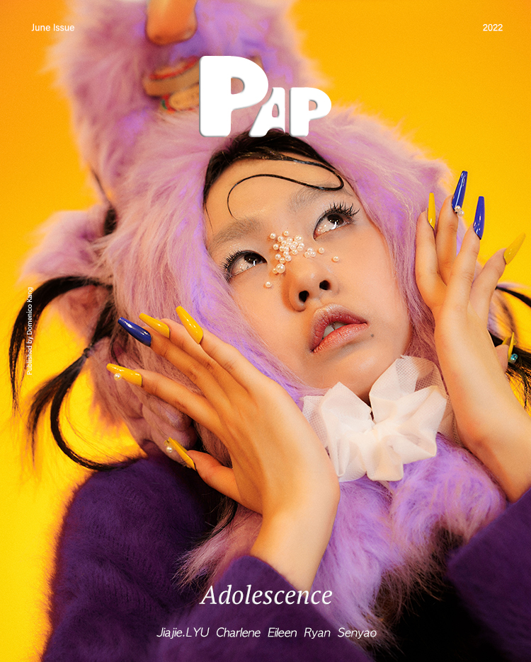
How is the color palette structured in the ADOLESCENCE editorial?
It's composed of colors like unwrapping candy—pink, lavender, orange, and electric blue intersecting. The palette visually captures adolescent emotional excess and moments of self-discovery.
What detail elements were used in this editorial?
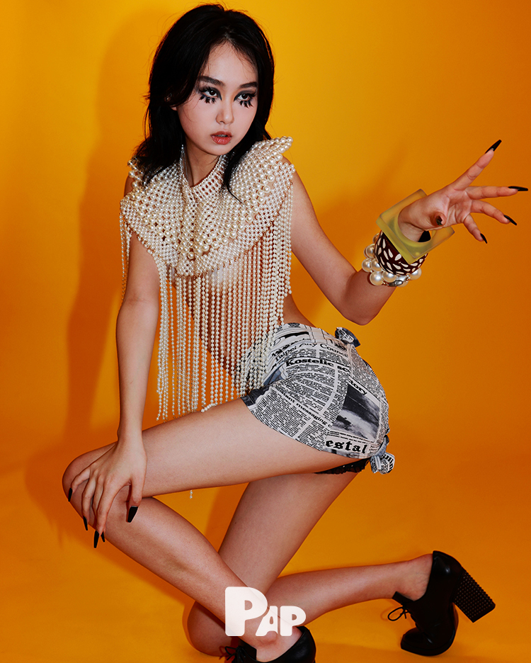
Electric blue and yellow-orange alternating nails, pearl studs around the nose, and a collar top with cascading pearl fringe. Newspaper-print miniskirts and white ribbon details express teenage sweetness and experimentalism simultaneously.
%22%2F%3E%3Ctext%20x%3D%22200%22%20y%3D%22250%22%20text-anchor%3D%22middle%22%20fill%3D%22rgba(255%2C255%2C255%2C0.2)%22%20font-family%3D%22sans-serif%22%20font-size%3D%2213%22%20font-weight%3D%22bold%22%20letter-spacing%3D%222%22%3EFATA%20MORGANA%3C%2Ftext%3E%3Ctext%20x%3D%22200%22%20y%3D%22275%22%20text-anchor%3D%22middle%22%20fill%3D%22rgba(255%2C255%2C255%2C0.1)%22%20font-family%3D%22sans-serif%22%20font-size%3D%2210%22%20letter-spacing%3D%223%22%3EPAP%20MAGAZINE%3C%2Ftext%3E%3C%2Fsvg%3E)