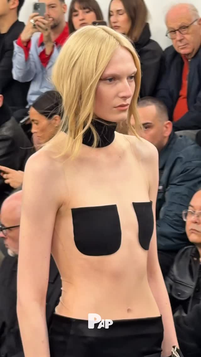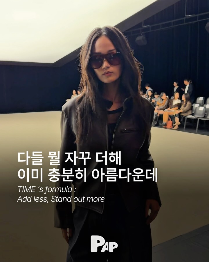
TIME has unveiled its Spring/Summer 2027 collection, THE FIRST LAYER: INTO ONE. In an era that keeps piling on, the collection chooses to subtract instead. Colors, materials, and silhouettes—contrasting elements are layered, scattered, and realigned to find a balance uniquely TIME's own. The message: the first layer, the most essential one, can be enough on its own.
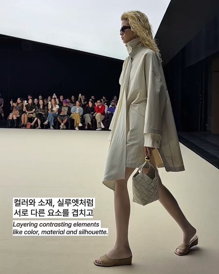
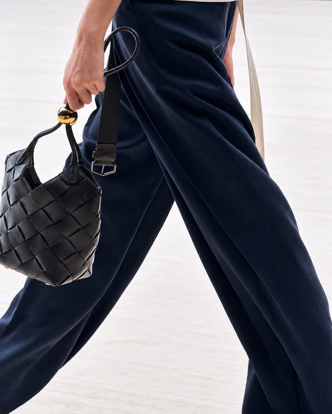
What defines this collection is the harmony of contrasts. A look pairing a light cream jacket with a butter yellow pleated skirt is emblematic. Different textures and color temperatures coexist while maintaining a unified mood overall. Accessories like a woven mini bag and slide sandals add presence within minimalist silhouettes. Not excessive, not sparse—just the right spot in between.
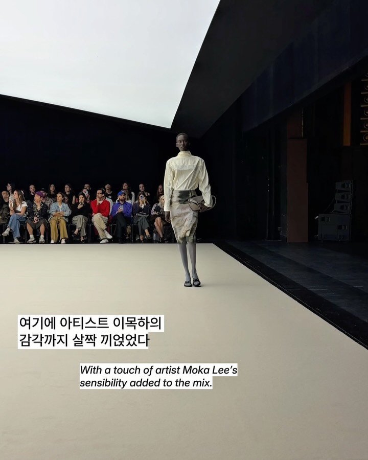
Artist Moka Lee's sensibility weaves through the collection. Just as she layers and deconstructs multiple images to create a single scene, this collection integrates different sensations into one body. Layering techniques are employed without heaviness; contrasts appear without collision. Colors and forms scatter, then reconverge to form TIME's distinct equilibrium.
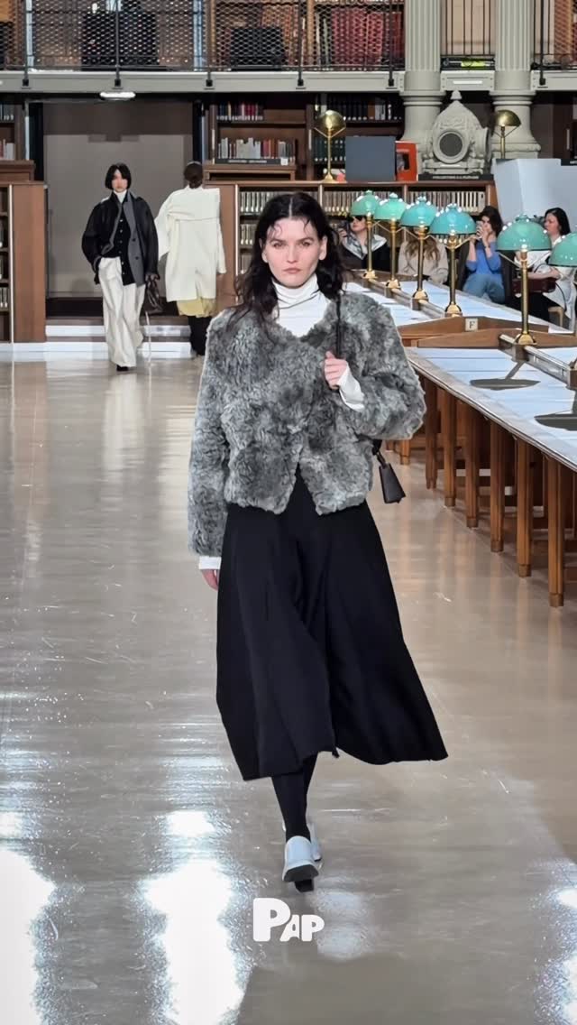
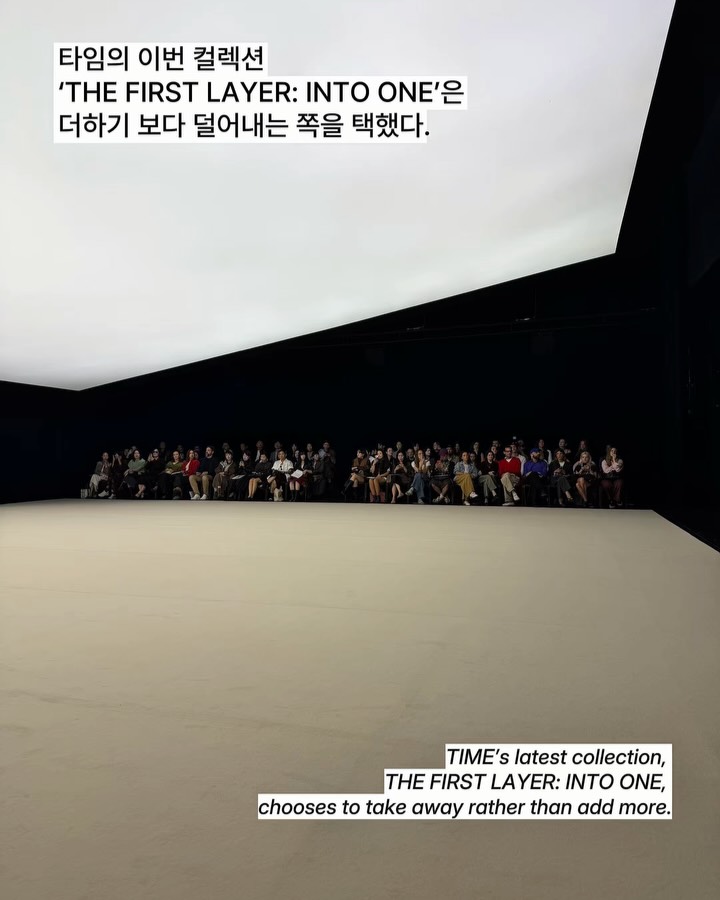
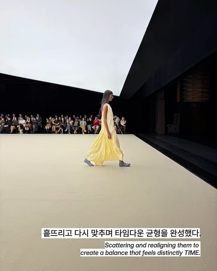
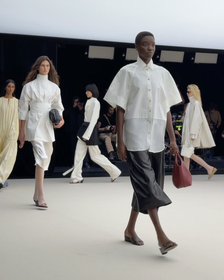
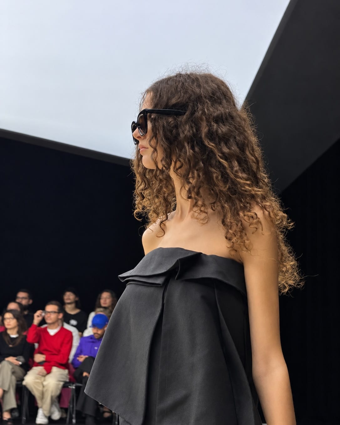
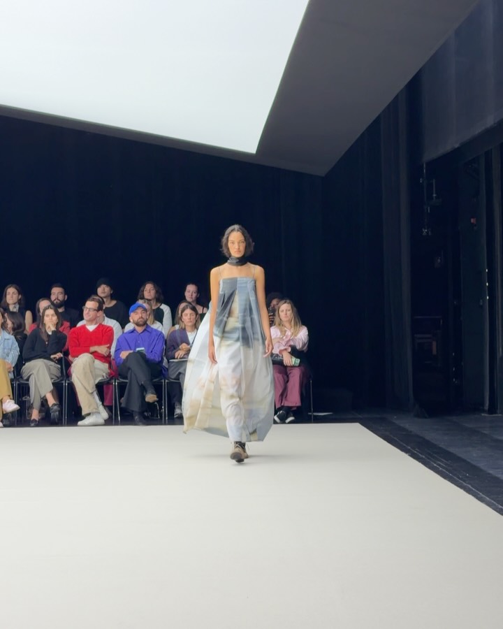
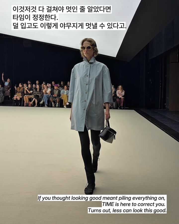
The runway itself was a statement. Cream, black, and yellow alternated down the line, clarifying the collection's key palette. Models wore varying textures and silhouettes, yet together they completed a single, coherent story. If you thought looking good meant piling everything on, TIME is here to correct you. Turns out, less can look this sharp.
How many layers are stacked in your wardrobe?
What defines this collection is the harmony of contrasts. A look pairing a light cream jacket with a butter yellow pleated skirt is emblematic. Different textures and color temperatures coexist while maintaining a unified mood overall. Accessories like a woven mini bag and slide sandals add presence within minimalist silhouettes. Not excessive, not sparse—just the right spot in between.
Artist Moka Lee's sensibility weaves through the collection. Just as she layers and deconstructs multiple images to create a single scene, this collection integrates different sensations into one body. Layering techniques are employed without heaviness; contrasts appear without collision. Colors and forms scatter, then reconverge to form TIME's distinct equilibrium.
The runway itself was a statement. Cream, black, and yellow alternated down the line, clarifying the collection's key palette. Models wore varying textures and silhouettes, yet together they completed a single, coherent story. If you thought looking good meant piling everything on, TIME is here to correct you. Turns out, less can look this sharp.
How many layers are stacked in your wardrobe?
FAQ
What is the concept behind Time's Spring/Summer 2027 collection THE FIRST LAYER: INTO ONE?
This collection focuses on stripping away. In an era of excess, we layered, scattered, and realigned contrasting elements like color, material, and silhouette to achieve Time's signature balance. It conveys that the first layer—the most essential—is enough to look great.
Which artist collaborated on Time's 2027 collection?
Artist Lee Mok-ha participated. His technique of layering and deconstructing multiple images into a single scene informed the collection, helping integrate disparate sensibilities into one cohesive body of work.
What are the key colors in Time's Spring/Summer 2027 collection?
Cream, black, and yellow are the key colors. These three alternated throughout the runway, vividly defining the collection's mood. A standout look paired a bright cream-toned jacket with a butter-yellow pleated skirt.