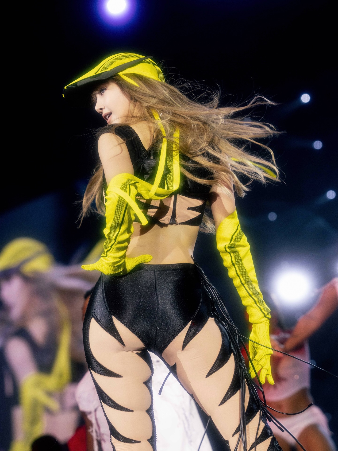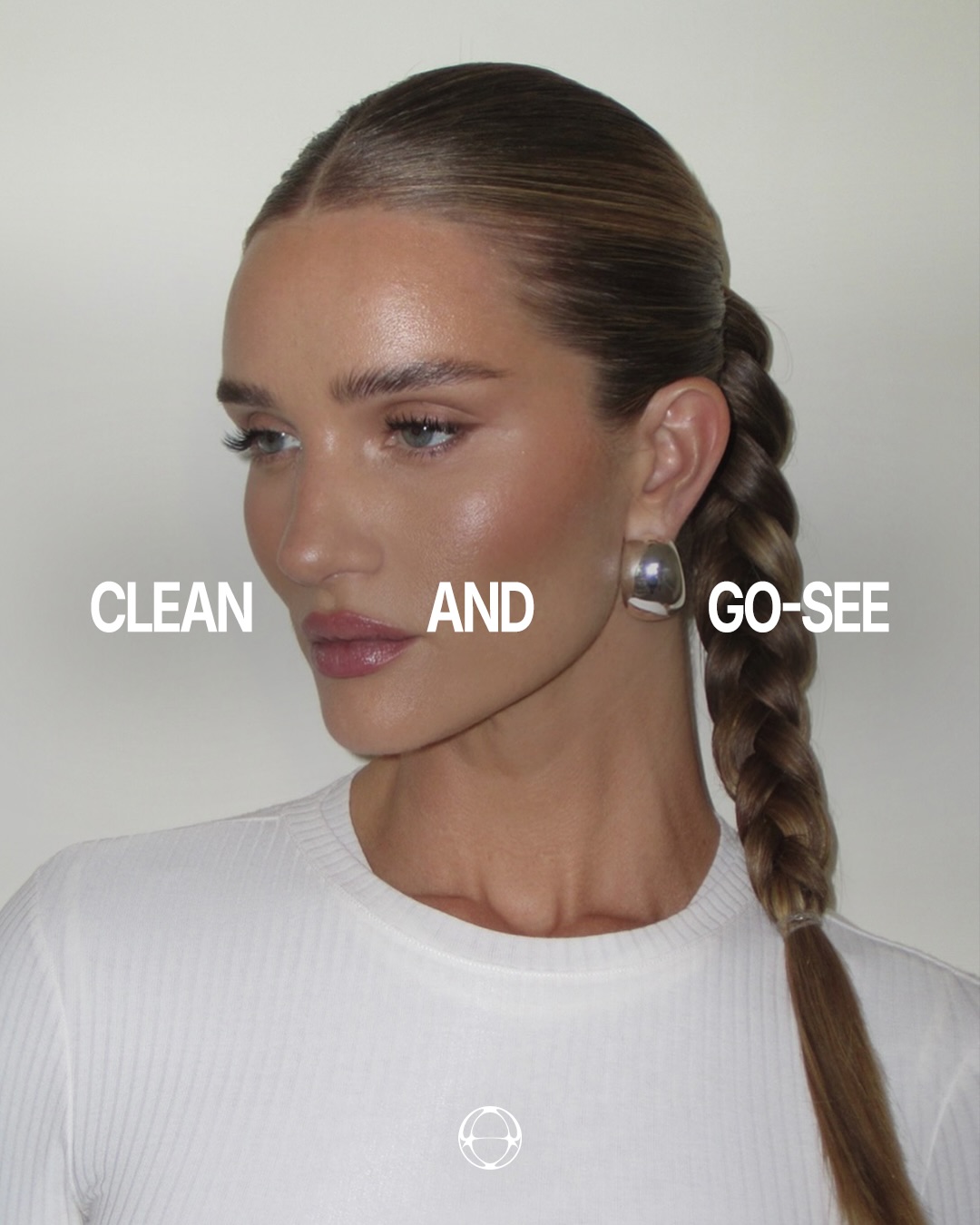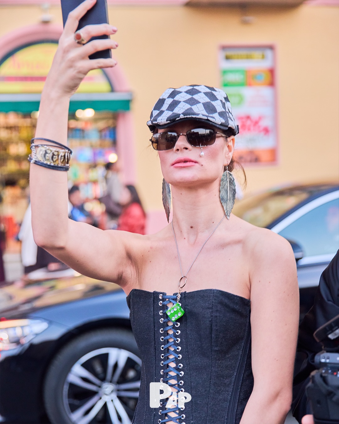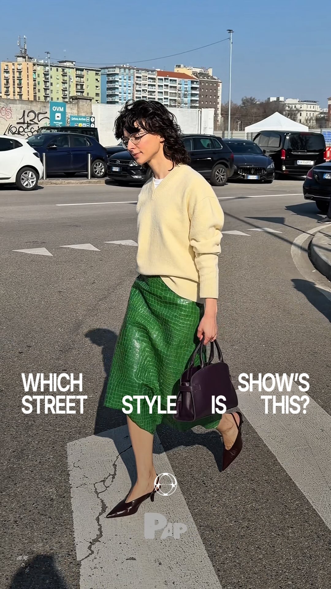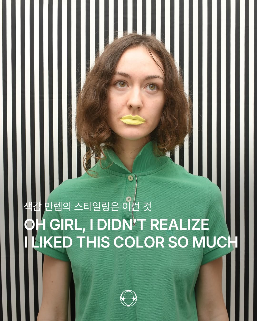
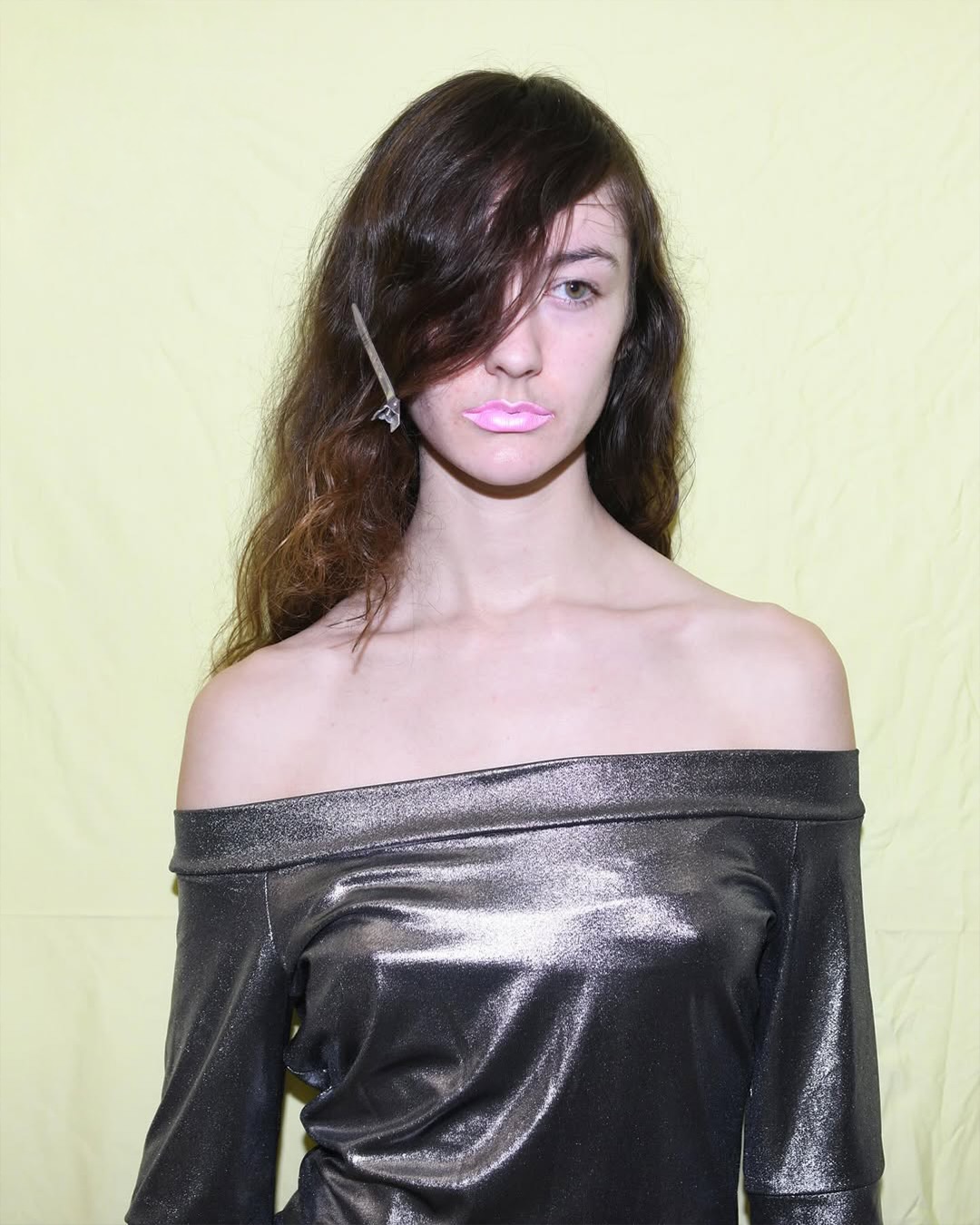
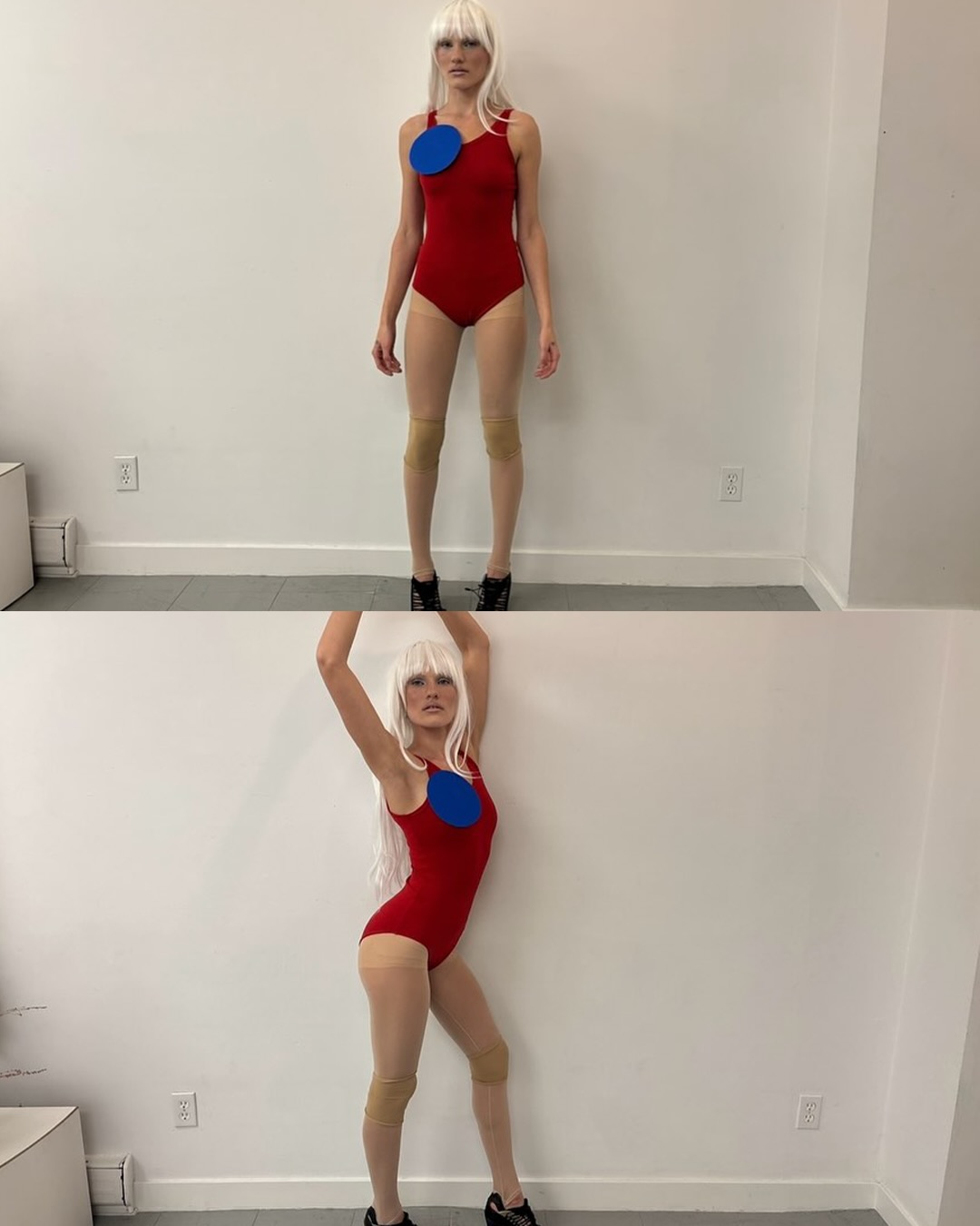
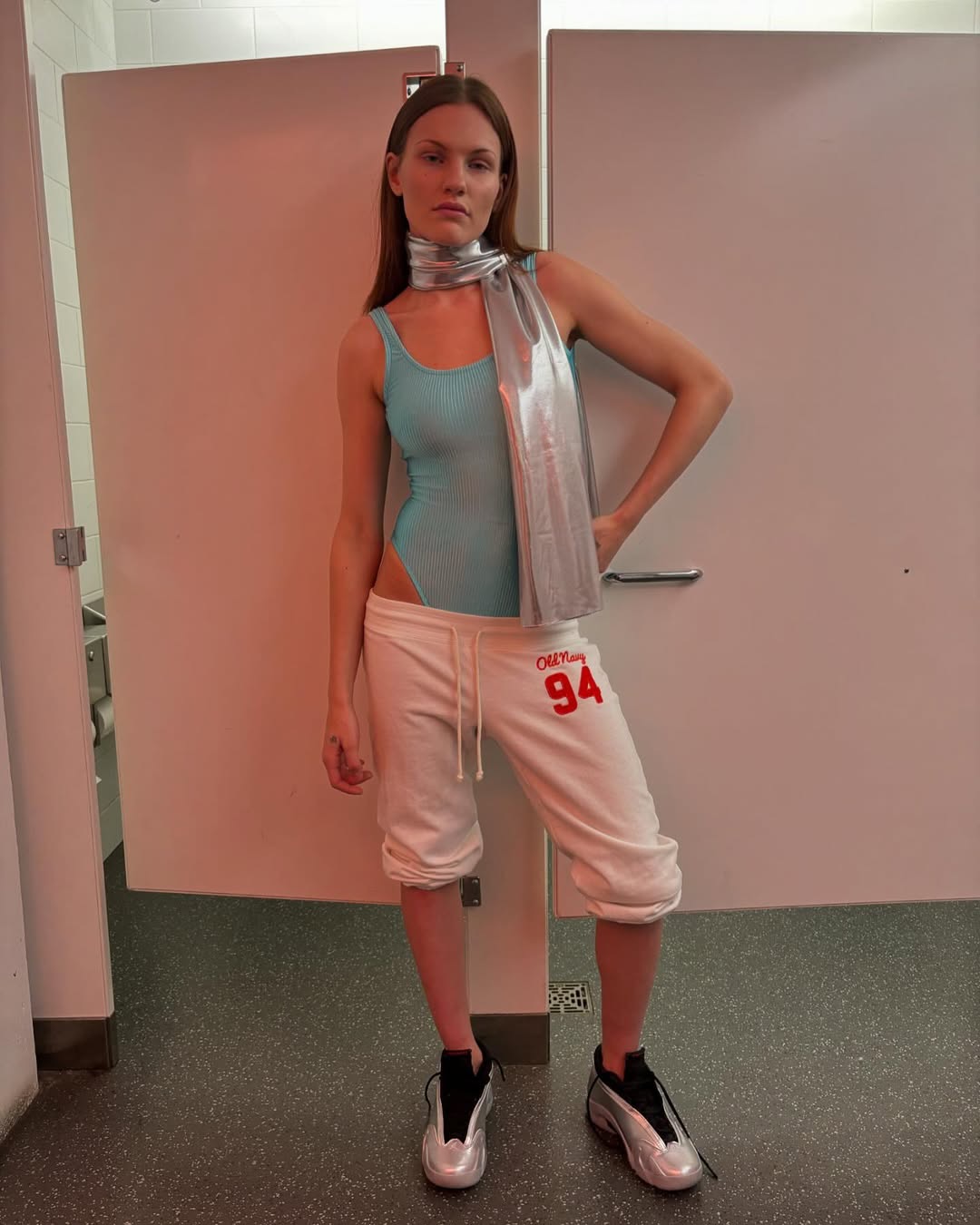
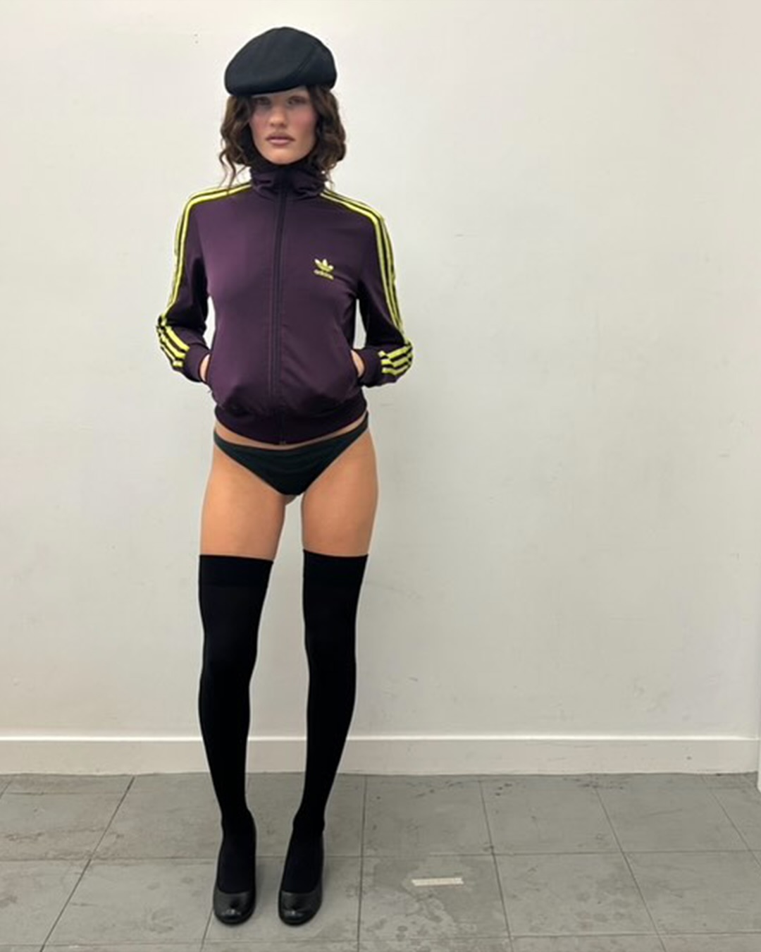
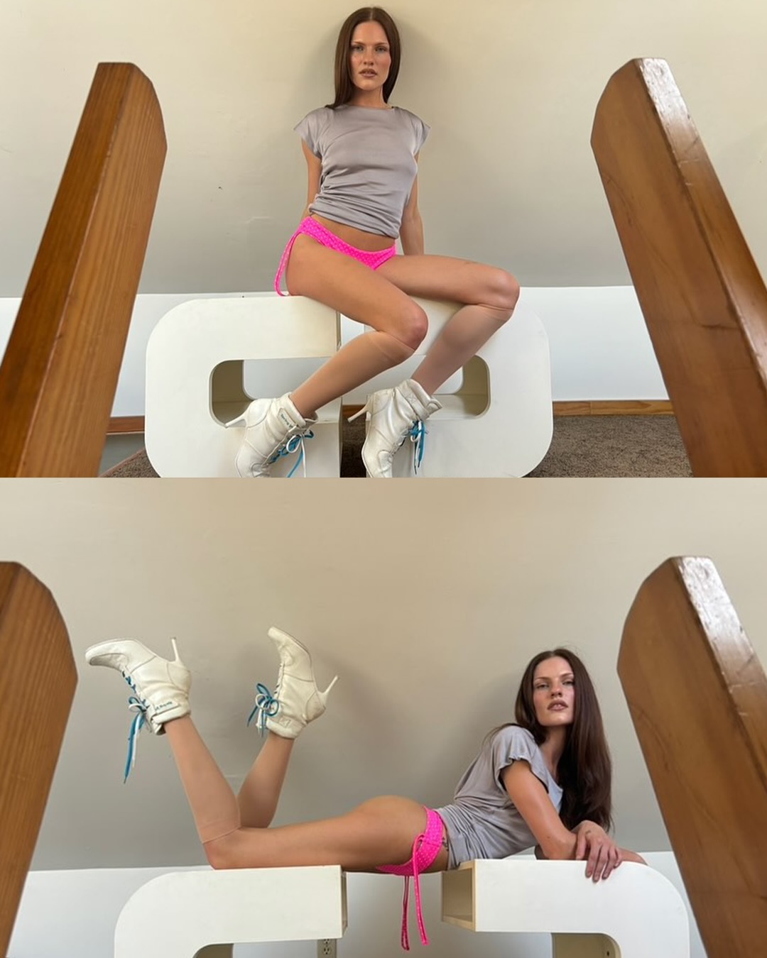
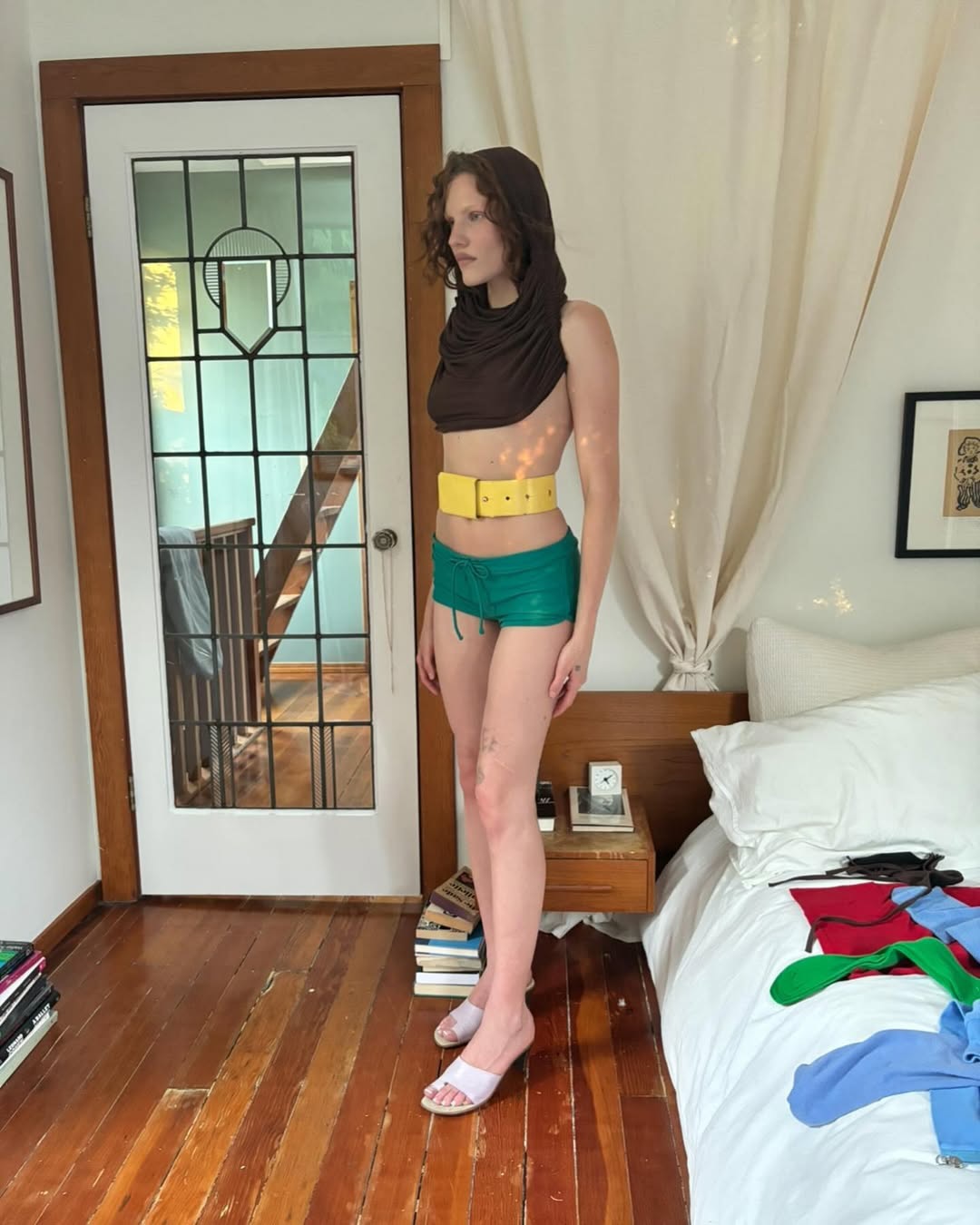
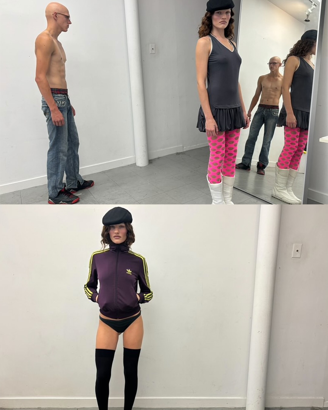
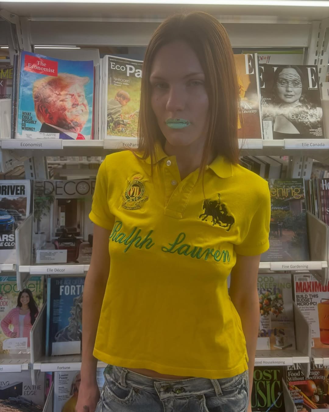
Is there another stylist who uses color this boldly? Boston Bachinski reveals the full power of primary hues while elevating combinations that seem destined to clash into a refined balance. Shades like vivid red, cobalt blue, and neon green—each with a commanding presence—somehow find harmony under her direction.
Bachinski's styling transcends mere color placement. Her daring contrasts and lively tonal play invite viewers to rediscover the beauty of color itself. While many contemporary fashion stylists focus on neutral palettes and minimalism, she champions the raw energy of primary colors and pushes them forward with confidence.
This styling offers an important preview of 2026 visual trends. A growing movement encourages us to abandon fear of color and embrace its inherent energy. Bachinski's work stands at the forefront, giving us the courage to do just that. Her ability to balance intensity with sophistication signals where fashion imagery is heading: bold, unapologetic, and alive.
Bachinski's styling transcends mere color placement. Her daring contrasts and lively tonal play invite viewers to rediscover the beauty of color itself. While many contemporary fashion stylists focus on neutral palettes and minimalism, she champions the raw energy of primary colors and pushes them forward with confidence.
This styling offers an important preview of 2026 visual trends. A growing movement encourages us to abandon fear of color and embrace its inherent energy. Bachinski's work stands at the forefront, giving us the courage to do just that. Her ability to balance intensity with sophistication signals where fashion imagery is heading: bold, unapologetic, and alive.
FAQ
What colors does Boston Bavinsky primarily use?
Boston Bavinsky boldly employs primary colors like intense red, cobalt blue, and neon green. Her styling signature lies in elevating seemingly clashing color combinations into sophisticated balance, rediscovering color's inherent appeal through contrast and tonal play.
How are fashion visual trends changing in 2026?
Visual trends in 2026 are expected to embrace primary color power. Instead of neutral tones and minimalism, bold color contrasts and vibrant tonal play will take center stage, with stylists like Boston Bavinsky leading this movement.
What is the essence of Boston Bavinsky's styling?
Bavinsky's styling essence lies in revealing primary colors while elevating clashes into refined balance. Her defining feature is fearlessly accepting color's inherent energy and making viewers reconsider color's appeal through bold contrasts.