ORANGE BALANCE
By PAP Magazine Editorial
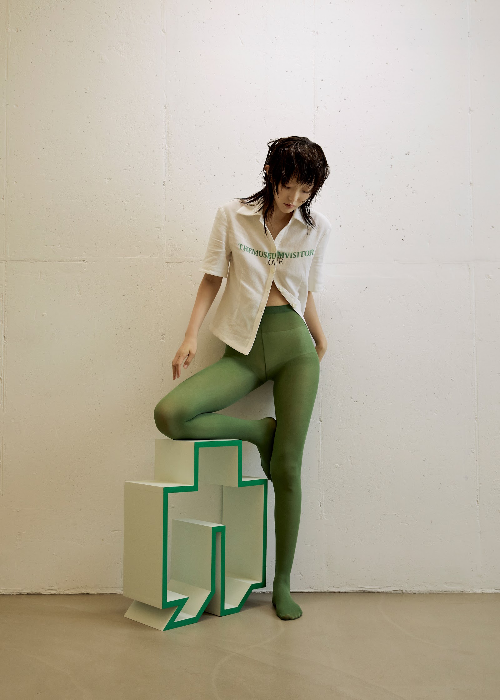
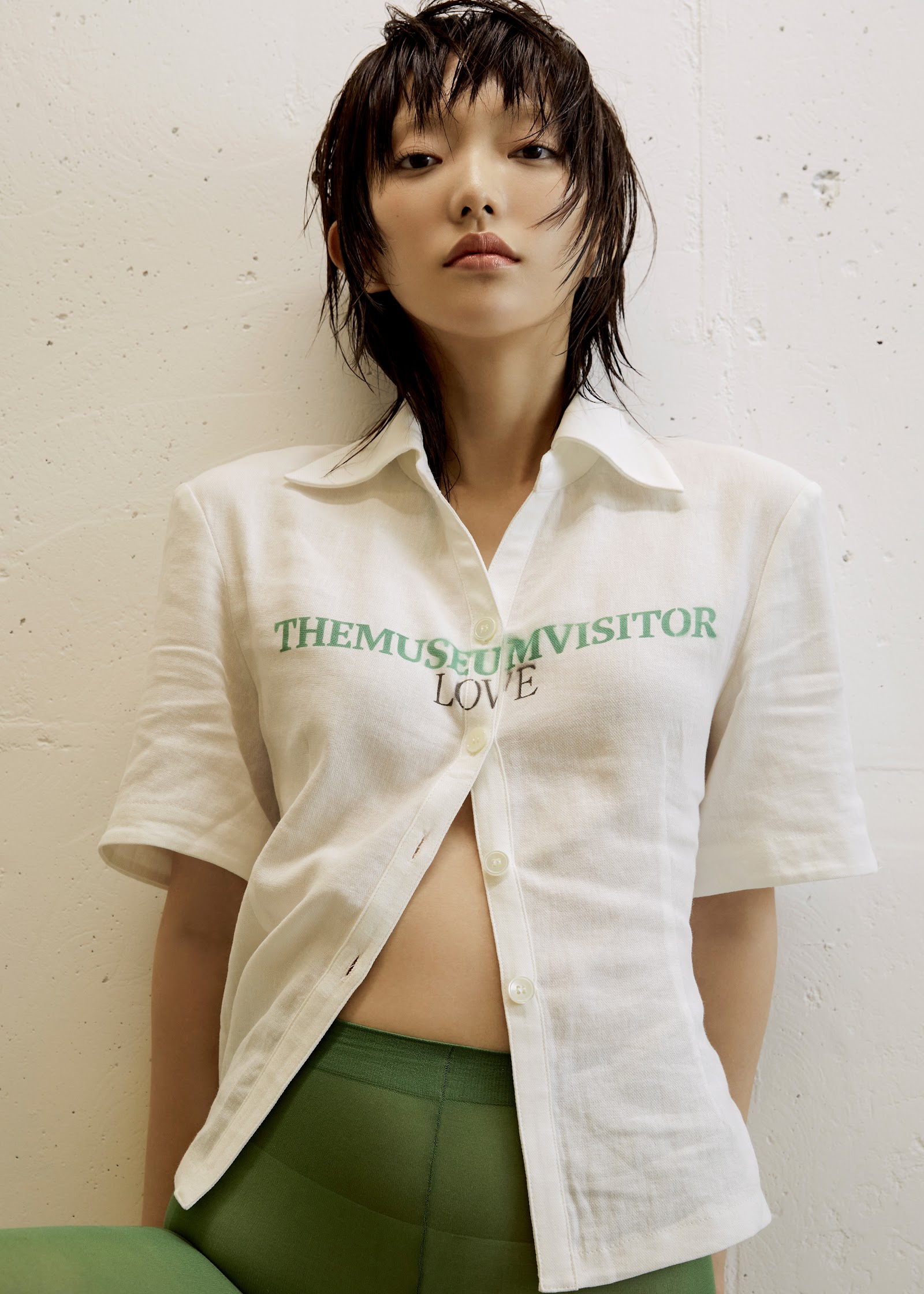
녹색 타이츠와 크림 컬러 셔츠가 만드는 기하학적 평형, 텍스트가 새겨진 상의에서 미술관을 향한 러브레터를 읽는다. 화면을 지배하는 건 올리브 그린 스타킹의 매끈한 표면인데, 그 위로 걸친 반소매 셔츠는 THEMUSEUM VISITOR LOVE라는 초록빛 타이포그래피를 담고 있다. 모델이 앉은 조형물은 계단처럼 쌓인 상아색 블록 구조로, 가장자리마다 선명한 초록 테두리가 윤곽을 그리며 평면과 입체의 경계를 강조한다. 짧게 자른 젖은 듯한 헤어는 이마와 볼을 스치고, 시선은 아래로 향해 명상적인 정적을 만든다. 벽의 거친 질감과 대비되는 매트한 색면 구성은 60년대 모더니즘 그래픽을 연상시키면서도, 지금 여기의 미니멀리즘으로 단단히 발을 디딘다. 전체 팔레트는 아이보리, 올리브, 에메랄드 그린 세 톤으로 수렴되며, 제목이 암시하는 '오렌지'는 부재 속에서 더 강렬한 여운을 남긴다.
Olive-green tights stretch taut across geometric cream blocks edged in vivid green, while a half-buttoned shirt bearing the phrase THEMUSEUM VISITOR LOVE anchors the frame in typographic wit. The model perches on a stacked sculptural pedestal whose clean lines and mint-green borders recall mid-century exhibition design, each block casting subtle shadows that articulate depth against the textured neutral wall. Her cropped hair falls damp and piecey across her forehead, and her downward gaze lends the composition a meditative stillness—museum-goer turned living installation. The palette is deliberately restrained: ivory, sage, and emerald converge in a study of chromatic balance, the promised orange of the title conspicuously absent, inviting the viewer to search for warmth in undertones and light. Styling fuses athletic second-skin legwear with utilitarian shirting, a dialogue between body and architecture that feels both conceptual and wearable, a quiet manifesto for colour as structure.


참여 크리에이터는 본인 작품을 무료로 다운로드할 수 있어요.